The GTM Leader’s Guide to Pipeline Attribution

Your LinkedIn team has a 40% connection acceptance rate. So what?
You’re sending 500 messages a week. Great. Your reps are getting 200 profile views per month. Wonderful. Your campaigns have a 15% reply rate. All of that sounds impressive until your CEO asks the question that actually matters:
“How much pipeline did LinkedIn generate this quarter?”
And you have no idea how to answer.
This is the vanity metrics trap that most sales teams fall into with LinkedIn outreach. You’re tracking activity that feels important: connections sent, messages delivered, sequences complete, but none of those numbers tell you if LinkedIn is actually contributing to revenue or just keeping your reps busy.
The problem gets worse when you try to report up.
Your SDR team runs LinkedIn campaigns for three months. They send 6,000 connection requests, get 2,400 acceptances, start 800 conversations, and book 120 meetings. Those numbers look solid when you review them in your weekly pipeline meeting.
But then finance asks you to justify the $15K you’re spending annually on LinkedIn automation, and you realize you have no way to connect those 120 meetings to actual closed revenue.
Did those meetings turn into opportunities? Did any of those opportunities close? How do they compare to meetings booked through other channels?
You don’t have any answers to that because your LinkedIn metrics live in one system, your pipeline data lives in your CRM, and nobody’s connecting the two.
This is the problem of attribution that most sales teams are facing nowadays.
In this guide, you’ll learn how to connect LinkedIn activity to actual pipeline and revenue so you can answer the questions that GTM leaders actually care about.
You’ll see how to set up proper attribution between Expandi and your CRM, which metrics to track at each level of your org, and how to build dashboards that show LinkedIn’s real impact on your business instead of just reporting vanity metrics that make your team look busy.
Let’s start with why LinkedIn ROI is invisible to most companies right now.
The Attribution Problem: Why LinkedIn ROI Is Invisible
LinkedIn outreach works. You’ve seen it work. Your reps book meetings from LinkedIn conversations all the time, but when you try to prove that to your finance team or your board, the data doesn’t exist. That’s because your systems aren’t set up to track it properly.
This is what we’ve seen happen behind the scenes:
Manual data entry kills consistency
Your reps are supposed to log every LinkedIn touchpoint in your CRM, so you have a complete record of how LinkedIn contributed to each deal, including connection request sent, message received, reply exchanged, and meeting booked.
In theory, this creates perfect visibility into your LinkedIn pipeline contribution.
In practice, however, your reps log maybe 30% of their LinkedIn activity, and only when they remember to do it. They’re juggling outreach across multiple channels, managing their pipeline, prepping for calls, and dealing with whatever fires popped up that day, which means stopping to manually log “sent LinkedIn connection request to John Smith at Acme Corp” isn’t high on their priority list when they’re trying to hit quota.
The result is incomplete data where some reps are diligent and log everything, others log nothing, and most fall somewhere in between. When you try to report on LinkedIn’s impact, you’re working with a fraction of the actual activity that happened.
Disconnected systems hide the full picture
Your LinkedIn activity lives in Expandi, your deals live in Salesforce or HubSpot, your email activity lives in Outreach or SalesLoft, and your call data lives in Gong or Chorus.
Each system knows its own slice of the customer journey, but none of them talk to each other automatically unless you’ve set up integrations.
When a rep connects with a prospect on LinkedIn, sends them an email two days later, calls them a week after that, and finally books a meeting, your CRM sees the meeting but has no record of the LinkedIn nurture that made that call successful.
This fragmentation means you can’t see the full story of how deals actually develop.
You know a meeting happened, but you don’t know that it took six LinkedIn messages over three weeks to get the prospect warm enough to take that call. The data exists somewhere, but it’s scattered across multiple tools that don’t communicate with each other.
First-touch attribution gives all the credit to the wrong channel
Most CRMs default to first-touch attribution, which means they credit whichever channel brought the lead into your system first. If a prospect fills out a form on your website, the CRM tags that deal as “website-sourced” and calls it a day.
But the reality is very different: your rep connected with that prospect on LinkedIn five weeks ago, and they exchanged messages about their current challenges.
Your rep shared a case study that addressed those specific pain points and answered questions about pricing and implementation. The prospect got interested but wasn’t ready to book a meeting yet, so your rep stayed in touch with relevant content and periodic check-ins. Two weeks later, the prospect visited your website to learn more and filled out a demo request form because they were finally ready to have a conversation.
Your CRM sees “form fill” and attributes the entire deal to your website, which means LinkedIn gets zero credit even though it did all the heavy lifting to warm up that prospect and move them toward a buying decision.
This is why your paid ads and your website look like they’re driving all your pipeline while LinkedIn looks like it’s barely contributing; the attribution model is fundamentally broken for channels that nurture over time instead of converting immediately.
Multi-touch complexity makes tracking nearly impossible
B2B deals don’t come from a single touchpoint. According to recent research, the average B2B purchase involves 6 to 10 decision makers and requires 62+ touchpoints across at least 3 channels before a deal closes which makes attribution exponentially more complex.
Your rep connects with the VP of Sales on LinkedIn and they message back and forth about their current outbound challenges. The VP mentions it to their Director of Sales Ops, so your rep connects with the Director and starts a separate conversation about their tech stack and process gaps. The Director brings in their RevOps lead because they want a technical perspective, which means your rep now needs to connect with them too and address a completely different set of concerns.
Now you’re running parallel conversations with three different people at the same account, each one contributing to the overall buying decision in different ways.
Meanwhile, one of them downloads a whitepaper from your website, another attends your webinar, and the VP finally books a demo after all three stakeholders have done their own research.
Which touchpoint deserves credit for creating that opportunity?
All of them played a role in moving the deal forward, but your CRM can only tag one source, which means you’re forced to pick a single channel and ignore all the others that contributed.
When you’re dealing with complex B2B sales cycles that involve multiple people and multiple channels, single-touch attribution models completely fail to capture reality.
The result: LinkedIn looks like it’s not working, even when it is.
Your reps are generating pipeline through LinkedIn conversations every week, but your CRM reports show LinkedIn contributing almost nothing.
Meanwhile, your website gets credit for opportunities that LinkedIn actually created, which means you’re optimizing the wrong channels and cutting budget from the activities that are actually working.
You need a better way to measure this, which means building a proper attribution framework that connects LinkedIn activity to real pipeline outcomes.
The Pipeline Attribution Framework
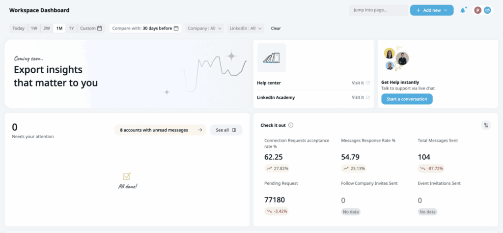
Most sales leaders track the wrong LinkedIn metrics because they’re measuring what’s easy to count instead of what actually matters.
Connection acceptance rates and message reply rates tell you if your outreach mechanics are working, but they don’t tell you if LinkedIn is generating revenue. You need a framework that connects activity all the way through to closed deals.
Here’s how to build a proper attribution model that actually shows LinkedIn’s impact on your business:
Tier 1: Activity Metrics (Operational)
These are the metrics your LinkedIn automation tool tracks automatically:
- Connection requests sent and accepted
- Messages sent and replied to
- Sequences completed
- Profile views and engagement signals
Your SDR managers check these daily because they show whether reps are executing the fundamentals. If someone’s acceptance rate drops from 35% to 15%, you know their messaging broke or their targeting went off. If reply rates tank, you need to fix your follow-up sequences.
When you’re running outreach at scale with multiple reps, tracking these metrics individually becomes a nightmare.
This is where Expandi’s Workspaces feature becomes essential for operational visibility.
Workspaces let you organize your team’s LinkedIn accounts into groups: by region, by product line, by rep, however makes sense for your structure and view aggregated performance metrics across all accounts in real-time.
Your sales manager can see which reps are hitting their daily activity targets, which campaigns are performing above or below average, and where execution gaps exist across the entire team without logging into each rep’s individual account.
This centralized view means you catch problems early instead of discovering two weeks later that half your team’s messaging was broken.
But activity metrics are not enough on their own. You can send 10,000 connection requests, get 4,000 acceptances, and exchange 1,500 messages without creating a single dollar of pipeline if you’re targeting the wrong people or your conversations aren’t moving prospects toward buying decisions.
Activity metrics tell you your team is busy, they don’t tell you if that activity is productive.
Tier 2: Engagement Metrics (Tactical)
Engagement metrics bridge the gap between raw activity and actual business outcomes:
- Conversations started (2+ message exchanges with real back-and-forth)
- Meetings booked from LinkedIn outreach
- Accounts engaged (multiple stakeholders contacted at the same company)
- Response quality (how many replies move toward a next step vs. polite brush-offs)
These metrics matter because they show whether your LinkedIn activity is creating real engagement that could lead to opportunities.
A meeting booked from LinkedIn is significantly more valuable than 100 connection requests sent, which means these metrics help you separate signal from noise in your outreach efforts.
Your sales managers use engagement metrics to evaluate individual rep performance and identify coaching opportunities. If a rep books three meetings per week from LinkedIn while everyone else books ten, you know they need help with their messaging or qualification process.
But engagement metrics still don’t show closed revenue.
You can book 50 meetings from LinkedIn conversations and generate zero pipeline if those meetings are with unqualified prospects who were never going to buy. Meetings are necessary but not sufficient; you need to track whether those meetings actually turn into opportunities and revenue.
Tier 3: Pipeline Metrics (Strategic)
Pipeline metrics connect LinkedIn activity directly to business outcomes that GTM leaders actually care about:
- Pipeline generated (dollar value of opportunities created where LinkedIn was involved)
- LinkedIn-influenced pipeline (opportunities where LinkedIn touched the prospect at any stage)
- LinkedIn-sourced pipeline (opportunities where LinkedIn was the first meaningful touch)
- Pipeline velocity (days from first LinkedIn touch to opportunity creation)
These are the metrics that matter in your quarterly business reviews because they show whether LinkedIn is contributing to your company’s growth targets.
When your VP of Sales asks “How much pipeline did we generate this quarter?” you need to answer with specific dollar amounts attributed to each channel, including LinkedIn.
Pipeline metrics also help you make smarter resource allocation decisions.
If LinkedIn-sourced opportunities close at 35% while website-sourced opportunities close at 18%, you know where to invest more of your team’s time. If LinkedIn-touched deals move through your pipeline 20% faster than deals without LinkedIn engagement, that velocity advantage compounds over time and helps you hit revenue targets more predictably.
This is where most sales leaders want to stop measuring because pipeline metrics feel like the finish line. But there’s one more tier that actually determines whether your LinkedIn investment is working.
Tier 4: Revenue Metrics (Executive)
Revenue metrics prove ROI and justify continued investment in LinkedIn outreach:
- Revenue attributed to LinkedIn (closed-won deals where LinkedIn played a role)
- Customer Acquisition Cost for LinkedIn-sourced deals (total cost divided by customers acquired)
- LTV:CAC ratio by channel (lifetime value vs. acquisition cost)
- Payback period (months to recover acquisition cost)
Your CFO and your board care about these metrics because they determine whether LinkedIn outreach is a profitable growth channel or an expensive experiment.
If your CAC for LinkedIn-sourced customers is $8,000 and their average LTV is $45,000, you have a 5.6:1 ratio that justifies scaling up your LinkedIn efforts. If that ratio drops to 1.5:1, you’re burning money and need to fix your targeting or your conversion process.
Revenue metrics also guide your hiring and budgeting decisions.
If each SDR generates $400K in LinkedIn-attributed revenue per year and their fully loaded cost is $85K, you know exactly how many SDRs to hire to hit your growth targets. If your payback period for LinkedIn-sourced customers is 6 months while paid ads show 18 months, you know which channel to prioritize when leadership asks where to invest next quarter’s budget.
How These Tiers Work Together
You need all four tiers working in combination to get a complete picture of LinkedIn’s impact on your business.
- Activity metrics tell you if your team is executing.
- Engagement metrics tell you if that execution is creating conversations.
- Pipeline metrics tell you if those conversations are turning into real opportunitiesRevenue metrics tell you if those opportunities are actually worth pursuing.
When something breaks, you look at the metrics in reverse order. If revenue numbers are down, you check pipeline metrics to see if you’re creating enough opportunities.
If the pipeline looks weak, you check engagement metrics to see if you’re booking enough meetings. If meetings are down, you check activity metrics to see if your outreach volume dropped or your targeting shifted.
This framework gives you the visibility you need to optimize at every level, from fixing individual rep messaging all the way up to making million-dollar budget allocation decisions.
Setting Up Proper Attribution (The Technical How-To)
Understanding the framework is one thing. Actually implementing it in your systems is where most teams get stuck. This section walks you through the technical setup so you can start tracking LinkedIn’s real impact on your pipeline.
Step 1: Define Your Attribution Model
Before you connect any systems or build any reports, you need to decide how you’re going to distribute credit across touchpoints. This decision shapes everything that comes after it, so you need to understand what each model actually does.
Let’s use a real scenario to see how each model works. A prospect connects with your rep on LinkedIn on Day 1. They exchange a few messages on Day 7. Two weeks in, they download a whitepaper from your website. On Day 21, they attend your webinar. Finally, on Day 28, they fill out a demo request form and an opportunity gets created worth $50K.
Here’s how each attribution model would handle this exact journey.
First-touch attribution gives 100% of the credit to the first interaction a prospect has with your company. In our scenario, LinkedIn gets credited with the full $50K opportunity because the connection request was the first touch. The whitepaper download, webinar attendance, and demo form get zero credit.
This model works well if you’re primarily focused on top-of-funnel activities and want to understand which channels are best at creating initial awareness. The problem is it completely ignores all the nurture that happens after that first touch, which means you systematically undervalue channels that move prospects from awareness to decision. Your webinar and your content get no credit even though they clearly played a role in moving this deal forward.
Last-touch attribution gives 100% of the credit to the final interaction before conversion. In our scenario, the demo request form (your website) gets credited with the full $50K opportunity because it was the last thing that happened before the opportunity was created. LinkedIn, the whitepaper, and the webinar all get zero credit.
This model shows you which channels are best at converting warm prospects into opportunities, but it ignores all the work that happened earlier in the journey to get that prospect warm in the first place. Your paid ads and your website will look amazing in last-touch reports because they often capture the final conversion, while LinkedIn looks terrible even when it did three weeks of nurture that made the conversion possible.
Multi-touch attribution distributes credit across all touchpoints that contributed to the deal. In our scenario, all five touchpoints get a portion of the $50K opportunity. If you’re using equal weighting, LinkedIn connection gets $10K, LinkedIn messages get $10K, whitepaper gets $10K, webinar gets $10K, and demo form gets $10K.
This gives you a more realistic view of how your channels work together to create a pipeline because it acknowledges that multiple interactions contributed to the deal. The challenge is deciding how to weigh each touchpoint. Do they all get equal credit, or do some touchpoints matter more than others? This is where the next two models come in.
Position-based attribution (also called U-shaped) gives more credit to the first and last touches, with the remaining credit distributed across everything in the middle. Using a common 40/40/20 split on our $50K opportunity: LinkedIn connection gets $20K (40%), demo form gets $20K (40%), and the three middle touches (LinkedIn messages, whitepaper, webinar) split the remaining $10K, getting roughly $3.3K each (20% total).
This model acknowledges that creating initial awareness and driving final conversion are both critical, while still giving some credit to nurture activities in between. It works well for B2B sales where both initial engagement and final conversion require significant effort, and it properly values LinkedIn’s role in starting the relationship without ignoring your website’s role in capturing the conversion.
Time-decay attribution gives more credit to touchpoints that happened closer to the conversion event. In our scenario, the demo form (Day 28) gets the most credit, the webinar (Day 21) gets slightly less, the whitepaper (Day 14) gets even less, and the LinkedIn touches (Day 1 and Day 7) get the least credit because they happened furthest from conversion.
Using a typical decay model, this might look like: demo form gets $20K, webinar gets $12K, whitepaper gets $8K, LinkedIn messages get $6K, and LinkedIn connection gets $4K. The exact distribution depends on your decay rate, but the pattern stays the same—more recent touches get more credit.
This model assumes that touchpoints closer to conversion had more influence on the buying decision, which makes sense for longer sales cycles where early touches might lose relevance over time.
Our recommendation for B2B: Use multi-touch attribution with position-based weighting as your default model. B2B deals involve too many touchpoints and too many stakeholders to give all the credit to a single interaction, and position-based weighting properly values both the channels that create awareness (like LinkedIn) and the channels that drive conversion (like your website).
In our example scenario, position-based attribution shows you that LinkedIn was critical for starting the relationship ($20K credit) and your website was critical for capturing the conversion ($20K credit), while your content and events played supporting roles ($10K combined credit). This gives you a much more accurate picture than first-touch (LinkedIn gets everything) or last-touch (website gets everything).
You can also run reports using different attribution models side-by-side to see how the picture changes. This helps you understand which channels are strong at initial engagement versus final conversion, which informs how you allocate budget and resources.
Step 2: Connect Your Systems
Once you know your attribution model, you need to connect Expandi to your CRM so LinkedIn activity flows into the same system where you track opportunities and revenue. This is where native integrations become essential.
Why native integrations beat manual tracking
You could theoretically have your reps manually log every LinkedIn touchpoint in your CRM. They send a connection request, they create a task in Salesforce. They get a reply, they log a note. They book a meeting, they create an event.
This breaks down immediately at scale. Reps forget to log touches, they log them inconsistently, and they waste 30-60 minutes per day on administrative work instead of actually selling. Your data ends up incomplete and unreliable, which makes any attribution analysis meaningless.
Native CRM integrations solve this by automatically syncing LinkedIn activity from Expandi into your CRM without any manual work required. Every connection request, every message exchange, every campaign engagement flows into the right contact record in real-time.
What data flows from Expandi to your CRM automatically:
When you connect Expandi to your CRM through a native integration, here’s what syncs automatically:
- Connection requests sent and accepted – Creates a touchpoint record showing when your rep reached out and whether the prospect accepted
- Messages sent and received – Logs the full conversation history so you can see exactly what was discussed and when
- Campaign engagement – Tracks which campaigns each prospect was part of and how they engaged with your sequences
- Meeting bookings – Creates calendar events and opportunity records when prospects book time with your team
This data flows into the contact and account records in your CRM, which means when you look at an opportunity, you can see the complete LinkedIn journey that led to that deal being created.
How to set up integrations: HubSpot, Salesforce, Pipedrive
Expandi offers native integrations with the major CRM platforms. The setup process varies slightly by platform, but the core steps are the same.
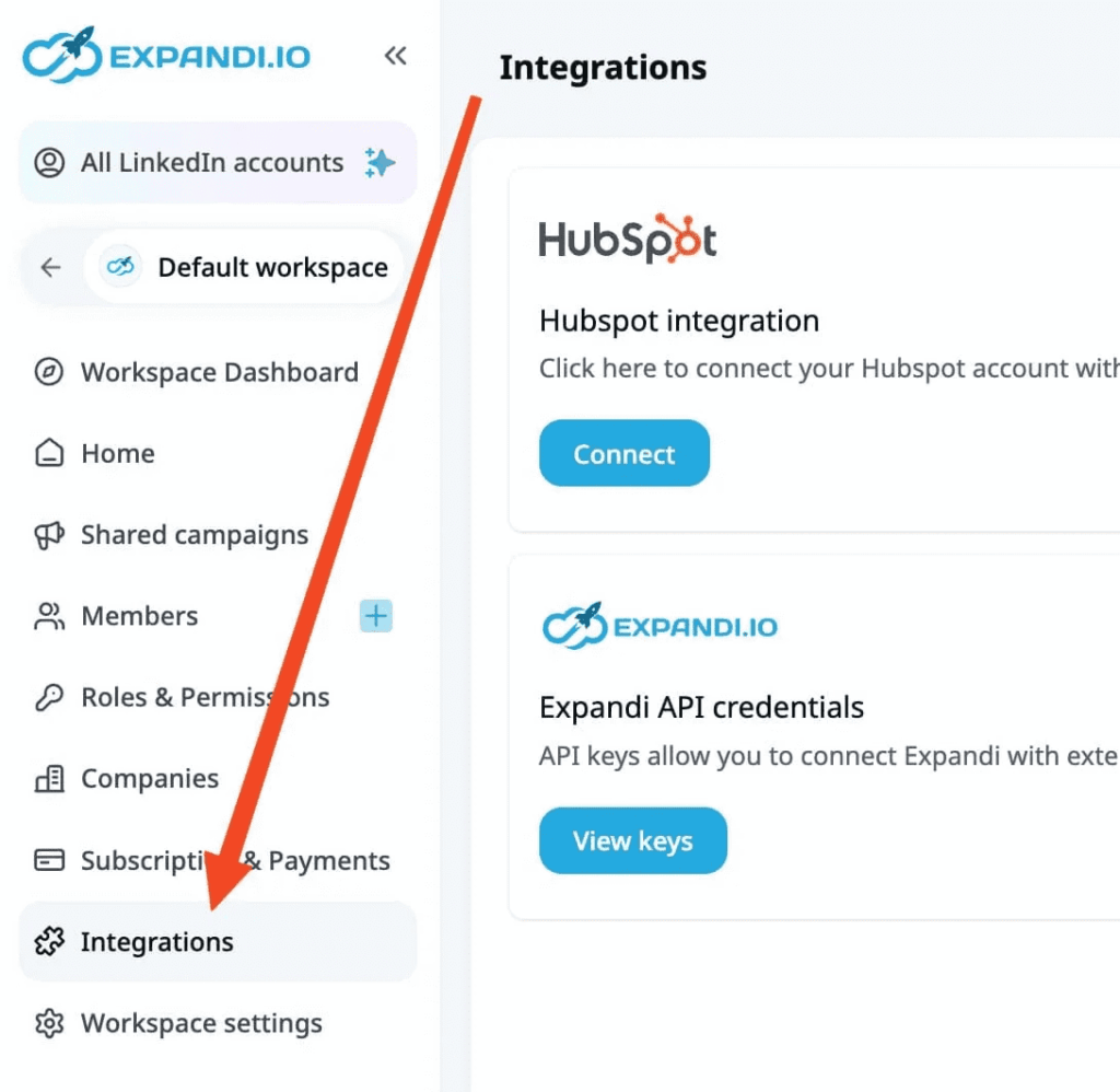
For HubSpot:
- Log into Expandi and go to Settings → Integrations.
- Click “Connect HubSpot” and authorize Expandi to access your HubSpot account.
- Choose which data you want to sync (contacts, companies, deals) and set your sync preferences (real-time or scheduled).
- Map your Expandi fields to your HubSpot properties so data flows into the right places.
- Test the connection by sending a test contact from Expandi and verifying it appears in HubSpot with the correct data.
For Salesforce:
- The setup is similar but requires admin permissions in Salesforce to install the Expandi package.
- Go to Settings → Integrations in Expandi, click “Connect Salesforce,” and follow the OAuth flow to authorize the connection.
- Install the Expandi managed package in Salesforce, which adds custom fields and objects needed to store LinkedIn activity data.
- Configure your field mappings to ensure LinkedIn touchpoints flow into the standard Salesforce activity timeline.
- Set up your automation rules to create tasks or update lead scores based on LinkedIn engagement.
For Pipedrive:
- Connect through Settings → Integrations in Expandi, authorize Pipedrive access, and configure which pipeline stages should trigger based on LinkedIn activity.
- Map your Expandi campaigns to Pipedrive deal stages so prospects automatically move through your pipeline as they engage with your outreach.
The key across all platforms is making sure your field mappings are correct before you start syncing data. If Expandi is trying to write to fields that don’t exist in your CRM, the sync will fail and you’ll lose attribution data.
Step 3: Create Custom Fields
Your CRM needs specific fields to track LinkedIn attribution properly. Most CRMs don’t include these by default, so you need to create custom fields that capture the data you care about.
Essential CRM fields to track:
| Field Name | What It Tracks | Why It Matters |
| LinkedIn Touch Count | Total number of LinkedIn interactions (connection requests, messages, profile visits, engagement) | Filter reports to compare opportunities with LinkedIn involvement vs. without. Shows which deals had LinkedIn in the mix. |
| First LinkedIn Touch Date | When your team first engaged with this contact on LinkedIn | Calculate pipeline velocity. Segment attribution by cohorts (Q1 vs Q2 deals). Understand time from first outreach to opportunity creation. |
| Last LinkedIn Touch Date | Most recent LinkedIn interaction with this contact | Identify actively nurtured deals vs. cold opportunities. If last touch was 90+ days ago, the deal needs re-engagement. |
| LinkedIn Campaign Source | Which Expandi campaign generated this contact | Track performance at campaign level. See which messaging strategies create the most pipeline. Discover that “Recent Job Change” campaign creates 3x more pipeline than generic outreach. |
| LinkedIn Engagement Score | Score based on depth and recency of interactions | Prioritize which opportunities need immediate AE attention. Prospect who replied 3x + booked meeting scores higher than someone who just accepted connection. |
Create these fields as custom properties in your CRM and make sure your Expandi integration is configured to populate them automatically as LinkedIn activity happens. Don’t rely on your reps to manually update these fields, automation is the only way to keep the data accurate and current.
Step 4: Build Your Reporting
Now that your systems are connected and your fields are configured, you can build reports that actually show LinkedIn’s impact on your pipeline.
How to create pipeline reports filtered by LinkedIn touches
Your first report should answer the simple question: “How much pipeline did LinkedIn create this quarter?”
In Salesforce, create a new Opportunities report and add a filter for “LinkedIn Touch Count greater than 0.” This shows you every opportunity where LinkedIn was involved at some point in the journey. Add columns for Opportunity Amount, Stage, Close Date, and Source to see the full picture.
Group this report by LinkedIn Campaign Source to see which campaigns are generating the most pipeline value. Sort by Opportunity Amount to identify your highest-value deals that came from LinkedIn outreach.
In HubSpot, create a custom report using the Deals object, filter for “LinkedIn Touch Count is known,” and add properties for Deal Amount, Deal Stage, and Create Date. Build a visualization that shows total pipeline value by LinkedIn Campaign Source over time.
The key insight you’re looking for is what percentage of your total pipeline has LinkedIn involvement. If LinkedIn touched 40% of your opportunities but your leadership team thinks it’s only contributing 10%, you have a measurement problem that this report solves immediately.
Setting up cohort analysis (deals touched by LinkedIn vs. not)
Cohort analysis helps you understand whether LinkedIn-touched deals perform differently than deals without LinkedIn engagement. This tells you if LinkedIn is actually improving your win rates and deal velocity or just creating additional touchpoints.
Create two segments in your CRM: Deals with LinkedIn Touch (LinkedIn Touch Count > 0) and Deals without LinkedIn Touch (LinkedIn Touch Count = 0 or null). Run comparative reports showing win rate, average deal size, and sales cycle length for each cohort.
If your LinkedIn-touched deals close at 35% while non-LinkedIn deals close at 22%, that’s a 13-point lift that proves LinkedIn is materially improving deal quality. If LinkedIn-touched deals move from Stage 1 to Closed-Won in 60 days while non-LinkedIn deals take 90 days, that 30-day velocity improvement means you can hit revenue targets faster with fewer opportunities in your pipeline.
This type of analysis is incredibly powerful in budget conversations because it shows LinkedIn’s impact relative to other channels, not just in absolute terms.
Creating trend reports to show improvement over time
Your final report should track how LinkedIn’s contribution is changing month-over-month or quarter-over-quarter. This helps you identify whether your optimization efforts are actually working.
Build a line graph showing LinkedIn-attributed pipeline by month for the past 12 months. Add a second line showing total pipeline so you can see LinkedIn’s percentage contribution over time.
If LinkedIn’s contribution is growing from 25% to 40% of total pipeline, you can justify increasing investment in LinkedIn outreach. If it’s declining, you know something changed in your execution and you need to diagnose what broke.
Create similar trend reports for LinkedIn touch count per deal, time to first LinkedIn touch, and LinkedIn campaign performance. These trends help you spot problems early before they tank your quarterly numbers.
The GTM Dashboard: What to Actually Monitor
Building reports is one thing. Building a dashboard that people actually use is completely different.
Most CRM dashboards fail because they’re either too detailed (50 metrics that nobody checks) or too generic (three vanity metrics that don’t drive decisions). You need dashboards tailored to who’s looking at them and what decisions they’re trying to make.
Here’s how to structure your LinkedIn attribution dashboards by timeframe and audience.
Weekly View (Operational Health)
Your SDR managers and frontline sales leaders check this dashboard every Monday morning to see if execution is on track or if something broke over the weekend. This is where you want to make sure your team is doing the work and catching problems before they cascade.
What to include:
Outreach volume by rep/team – Shows how many connection requests each rep sent, how many messages they delivered, and how many sequences they completed this week. You’re looking for consistency here. If someone who normally sends 100 requests per week only sent 20, either they’re focused on closing deals (good) or they stopped prospecting (bad). You need to know which one so you can course-correct.
Display this as a simple bar chart with each rep’s name on the Y-axis and their activity count on the X-axis. Color-code bars based on whether they hit their weekly target (green), fell slightly short (yellow), or missed significantly (red). This makes underperformance immediately visible without requiring your managers to dig through numbers.
Response rates trending – Tracks connection acceptance rates and message reply rates over the past four weeks. You’re not looking at absolute numbers here; you’re looking for sudden drops that indicate messaging problems or targeting shifts.
If your team’s acceptance rate drops from 38% to 18% in one week, something changed. Maybe LinkedIn updated their algorithm and flagged your accounts. Maybe someone changed the connection request template and made it too salesy. Maybe your targeting filters shifted, and you’re reaching the wrong people. Whatever the cause, you need to see it fast so you can fix it before it burns through your entire prospect list.
Show this as a line graph with weeks on the X-axis and percentage rates on the Y-axis. Include a horizontal reference line showing your team’s average rate so deviations are obvious.
Meetings booked this week – Displays how many meetings each rep booked from LinkedIn conversations. This is your bridge metric between activity and pipeline; it shows whether all that outreach is actually creating sales opportunities.
Break this down by rep and by campaign so you can see both individual performance and which messaging strategies are working best. If your “Job Change Trigger” campaign books 15 meetings while your “Generic Outreach” campaign books 2, you know which approach to scale.
Deals created this week with LinkedIn touch – Shows opportunities that entered your pipeline this week where LinkedIn was involved at any stage. This connects your weekly activity directly to pipeline outcomes and helps you spot whether your current outreach efforts are translating into real opportunities.
Include the total dollar value of these opportunities so your team can see not just the count but the potential revenue impact. Five opportunities worth $200K total is very different from five opportunities worth $20K.
How to use this dashboard:
Your SDR managers pull this up in their Monday morning team standup. They call out reps who are crushing their numbers and ask what’s working. They flag reps who are underperforming and schedule coaching sessions. They identify campaigns that are booking meetings at high rates and shift more volume toward those approaches.
This dashboard should trigger immediate action items, not just passive observation. If something’s red, you fix it this week.
Monthly View (Strategic Performance)
Your sales leadership team reviews this dashboard in their monthly pipeline meetings to understand whether LinkedIn is contributing to quarterly goals and where to adjust resource allocation. This is where you connect LinkedIn activity to actual business outcomes.
What to include:
Pipeline generated by LinkedIn ($ and %) – Shows the total dollar value of opportunities created this month where LinkedIn was involved, plus what percentage of your overall pipeline that represents.
If you created $2.4M in total pipeline this month and LinkedIn touched $960K of it, that’s 40% contribution. This number tells you whether LinkedIn is a core channel or a nice-to-have. Anything above 30% means LinkedIn is a primary pipeline driver and deserves significant investment. Below 15% means you’re either underutilizing it or your attribution tracking is broken.
Display this as a combination chart with bars showing LinkedIn pipeline value by month and a line showing the percentage contribution. This lets you see both absolute growth and relative importance at the same time.
Pipeline velocity comparison (LinkedIn-touched vs. not) – Compares how fast deals move through your pipeline when LinkedIn is involved versus when it’s not. Measure this as average days from opportunity creation to Closed-Won for each cohort.
If LinkedIn-touched deals close in 45 days while non-LinkedIn deals take 75 days, that 30-day difference means LinkedIn is accelerating your sales cycle by 40%. This velocity advantage compounds because you can close more deals in the same time period, which means you hit revenue targets faster or with fewer opportunities required.
Show this as a side-by-side bar chart with two bars per stage: one for LinkedIn-touched deals and one for non-LinkedIn deals. Include the percentage difference prominently so the impact is clear.
Win rate comparison – Tracks the percentage of opportunities that close successfully for LinkedIn-touched deals versus non-LinkedIn deals. This tells you whether LinkedIn is improving deal quality or just adding noise to your pipeline.
If your overall win rate is 28% but LinkedIn-touched deals close at 35%, that 7-point lift means LinkedIn is helping you win deals you might otherwise lose. If LinkedIn-touched deals actually have a lower win rate, it suggests you’re creating low-quality opportunities and need to fix your qualification process.
CAC by channel – Calculates your Customer Acquisition Cost for LinkedIn-sourced deals and compares it to other channels. Take your total LinkedIn investment (tools + headcount allocated to LinkedIn outreach) divided by the number of customers acquired where LinkedIn was the source.
If your LinkedIn CAC is $4,500 and your paid ads CAC is $12,000, you’re acquiring customers 2.6x more efficiently through LinkedIn, which justifies shifting budget away from paid ads toward more LinkedIn headcount. If LinkedIn CAC is higher than other channels, you need to either improve conversion rates or reduce costs.
Display this as a horizontal bar chart showing CAC for each channel side-by-side. Color-code bars based on whether they’re above or below your target CAC threshold.
How to use this dashboard:
Your VP of Sales uses these metrics to decide where to invest next quarter’s budget. If LinkedIn is generating 40% of the pipeline with only 20% of your GTM budget, that’s an obvious signal to reallocate resources. If pipeline velocity is 30% faster for LinkedIn-touched deals, you prioritize LinkedIn outreach for opportunities where speed matters.
This dashboard drives quarterly planning decisions and budget allocation across your entire revenue team.
Quarterly View (Executive Decisions)
Your CEO, CFO, and board look at this dashboard once per quarter to understand overall channel performance and make long-term strategic decisions about headcount, tools, and go-to-market strategy. Everything here connects directly to revenue and ROI.
What to include:
Revenue attributed to LinkedIn – Shows the total revenue from Closed-Won deals where LinkedIn was involved at any stage during the quarter. This is the number your CFO cares about because it proves LinkedIn is generating actual revenue, not just a pipeline that never converts.
Break this down by attribution model (first-touch, last-touch, multi-touch) so you can show LinkedIn’s contribution from different perspectives. If LinkedIn is responsible for $1.2M in first-touch revenue, $800K in last-touch revenue, and $2.1M in multi-touch revenue, each number tells a different story about LinkedIn’s role in your revenue generation.
ROI calculation (revenue / tool + labor costs) – Calculates your return on investment for LinkedIn as a channel. Take your total LinkedIn-attributed revenue for the quarter and divide it by your total investment (Expandi subscription + fully loaded cost of SDRs doing LinkedIn outreach).
If you generated $3.6M in LinkedIn-attributed revenue and spent $240K on tools and headcount, that’s a 15x ROI. This number justifies continued or increased investment. If ROI drops below 3x, you need to either improve conversion rates or reduce costs to make the channel viable.
Show this as a simple ratio with a trend line showing how ROI has changed over the past four quarters. If the trend is upward, you’re improving efficiency and should scale. If it’s declining, you need to diagnose what’s breaking.
Channel mix optimization – Displays what percentage of your total revenue comes from each channel (LinkedIn, paid ads, website, referrals, events, etc.) and what percentage of your budget you’re allocating to each.
The goal is to identify mismatches where a channel is generating 35% of revenue but only getting 15% of budget, or where a channel is consuming 40% of budget but only generating 10% of revenue. These mismatches show you where to reallocate resources for maximum impact.
Use a stacked bar chart showing budget allocation vs. revenue contribution for each channel. Channels where revenue exceeds budget allocation are underinvested opportunities. Channels where the budget exceeds revenue contribution are inefficient and need optimization or cuts.
Headcount planning based on productivity metrics – Shows average revenue per SDR for reps focused on LinkedIn outreach versus other channels. This helps you decide how many SDRs to hire and where to deploy them.
If each LinkedIn-focused SDR generates $450K in attributed revenue per year and costs $90K fully loaded, you can hire as many as your market allows because each one delivers 5x ROI. If productivity drops to $180K per SDR, you’re approaching break-even and need to improve processes before hiring more.
Display this as a scatter plot with SDR count on the X-axis and revenue per SDR on the Y-axis. Include a trend line showing whether productivity is improving or declining as you scale, which tells you if you can maintain quality as you grow.
How to use this dashboard:
Your executive team uses these metrics to make major strategic decisions. Should we hire 5 more SDRs or invest in paid ads? Should we shift the budget from events to LinkedIn outreach? Should we expand our LinkedIn strategy to new markets or double down on our current approach?
This dashboard answers those questions with data instead of gut feel, which means you make better resource allocation decisions and deploy capital more efficiently.
What an Ideal Dashboard Actually Looks Like
The best dashboards share a few common characteristics regardless of which metrics they display. They:
- Load fast, so people actually open them.
- Use visual hierarchy to highlight the most important metrics first.
- Include comparison data (this month vs. last month, this quarter vs. target) so you can see trends at a glance.
- Are role-specific so each person sees exactly what they need without wading through irrelevant data.
Build separate dashboards for each audience and link them together so people can drill down when they need more detail.
Your CEO views the quarterly executive dashboard, clicks on LinkedIn’s revenue contribution, and drills into the monthly strategic view to see which campaigns drove that revenue.
Your VP of Sales views the monthly performance metrics, clicks on win rate, and drills into the weekly operational view to see which reps are creating the highest-quality opportunities.
This layered approach keeps each dashboard simple and focused while still providing access to deeper data when needed.
Common Mistakes and How to Avoid Them
Most teams make the same five mistakes when setting up LinkedIn attribution. These errors systematically hide LinkedIn’s real impact and lead to bad budget decisions.
Mistake 1: Only tracking last-touch attribution (misses LinkedIn’s nurture role)
Last-touch attribution gives all the credit to whatever channel captured the final conversion, which means your website and paid ads look amazing while LinkedIn looks useless.
This completely ignores that LinkedIn does nurture work over weeks, not instant conversions. Your rep spends three weeks warming up a prospect on LinkedIn, they finally visit your website and fill out a form, and your CRM credits the website with the entire deal.
Fix: Use multi-touch attribution as your primary model. Run last-touch as a secondary view to see which channels convert best, but don’t use it as your only measurement or you’ll systematically undervalue every nurture channel.
Mistake 2: Not distinguishing sourced vs. influenced (overcredits or undercredits)
“Sourced” means LinkedIn was the first meaningful touch that created the relationship. “Influenced” means LinkedIn touched the prospect somewhere during their journey but wasn’t first.
When you don’t separate these categories, you either count every LinkedIn touch as “sourced” (inflating its importance) or only count first-touch (ignoring mid-funnel work).
Fix: Create separate CRM fields for “Source Channel” and “Influenced Channels.” Build reports for both the sourced pipeline and the influenced pipeline so you can see LinkedIn’s top-of-funnel contribution and its mid-funnel impact separately.
Mistake 3: Comparing LinkedIn to paid ads on a first-touch basis (apples to oranges)
Paid ads drive immediate action: someone clicks, converts, done. LinkedIn builds relationships over weeks. Comparing them using first-touch attribution makes ads look amazing, and LinkedIn look terrible, even when LinkedIn is generating more total pipeline. You’re measuring two completely different activities with a metric that only captures one type.
Fix: Compare channels using metrics that match their purpose. Use first-touch for awareness channels like ads. Use multi-touch for nurture channels like LinkedIn. Use influence metrics for mid-funnel acceleration. This shows each channel’s real contribution.
Mistake 4: Ignoring pipeline velocity and deal size (revenue isn’t just about volume)
Most attribution reports only track how much pipeline each channel created, not whether those opportunities are high-quality or how fast they close.
A channel that creates 100 small deals with 15% win rates and 90-day cycles is worse than a channel that creates 50 large deals with 30% win rates and 45-day cycles, but volume-only reports make them look equal.
Fix: Track average deal size, win rate, and sales cycle length by channel alongside pipeline volume. If LinkedIn-touched deals are larger, close faster, or win more often, that matters as much as how many opportunities LinkedIn creates.
Mistake 5: Building reports no one looks at (make dashboards actionable)
Teams build elaborate dashboards with 40 metrics that nobody checks because they don’t answer specific questions or drive clear actions.
Your SDR manager doesn’t need executive ROI calculations. Your CFO doesn’t need individual rep activity metrics. When everyone sees the same generic dashboard, nobody finds it useful.
Fix: Build role-specific dashboards that answer the exact questions each person needs to make their decisions. SDR managers get operational metrics that help them coach reps. Sales leadership gets strategic metrics that drive budget allocation. Executives get ROI metrics that justify continued investment.
Each dashboard should trigger specific actions, not just display data.
Connect Expandi to Your CRM and Start Tracking Real Attribution
When LinkedIn activity lives in one system and pipeline data lives in another, you’re making budget decisions based on incomplete information. Your website gets credit for deals LinkedIn actually created. Your paid ads look more effective than channels doing the actual nurture work. You’re optimizing the wrong channels because your attribution model only tracks the final click.
Proper attribution changes that picture completely. You see which campaigns are generating pipeline, not just meetings. You measure win rates and deal velocity by channel, not just activity volume. You prove LinkedIn’s contribution to revenue with data your CFO actually trusts.
With Expandi’s native CRM integrations, you can:
- Sync LinkedIn activity automatically into Salesforce, HubSpot, or Pipedrive
- Track every touchpoint from first connection to closed deal
- Stop defending channels with anecdotal evidence and start justifying investment with real analytics
The goal is to measure what actually drives revenue, not just what’s easy to count. Expandi helps you do that.Ready to connect Expandi to your CRM and start tracking real attribution? Try Expandi free for 14 days.
You’ve made it all the way down here, take the final step