Lead Generation Website — How To Capture as Many Leads on Your Website as Possible

Your website is often the first experience prospective customers will have with your brand.
That’s why it’s crucial to have a website that can:
- Attract your target audience
- Compel and engage your website visitors enough to stay there and explore
- Gain their trust and convince them that your product is the best choice for them
- Convert website visitors into quality leads
- Push visitors to make a decision and go through with the purchase right then and there
A well-designed website optimized for conversions can do more than just wow leads — it can become a complete sales funnel.
As such, it will be able to direct and guide your leads through their entire buyer journey — top to bottom.
Although creating such a lead generation website may sound tricky, we have something very nifty for you.
In this article, we’ll share 12 website lead generation tips and tricks based on consumer psychology that can transform any old website into a well-oiled lead generation machine.
Here’s a sneak peek of what we’ll cover in detail:
And here’s a summary of our findings:
TL;DR
- You can get visitors to trust you using social proof and professionalism.
- You can improve your website (and thus, generate more leads) by speeding up your website, making your website mobile-friendly, leveraging white space, and optimizing your Calls To Action (CTAs).
- You can nurture leads with gamified elements, gated content, and quizzes.
- Personalized CTAs and live chat improve the chances of a lead converting.
- LinkedIn is the number #1 platform for lead generation. Expandi can help you improve your LinkedIn outreach, and you can test out Expandi with a 7-day free trial.
#1. Add trust signals to show social proof
We’ve all been there before — ending up on a landing page that doesn’t feel right.
You know something’s fishy about it, although you can’t quite put your finger on it.
And whatever it may be, one thing is for sure: no one is going to leave their information on that website, let alone purchase anything.
The main reason websites give off such a suspicious vibe is the lack of so-called “trust signals”.
Those signals convey a very clear message to your website visitors: “we’re a legit business and not another scammer who is only after your hard-earned money”.
Common trust signals include:
- A comprehensive “about us” web page where you share your brand’s story, policies, core values, etc.
- Contact information, including an email address, phone number, and the physical address of your company’s headquarters
- A lack of spammy Search Engine Optimization (SEO) (something that many spammy websites often have)
- Information on your team and founders so that leads can put a face to the brand
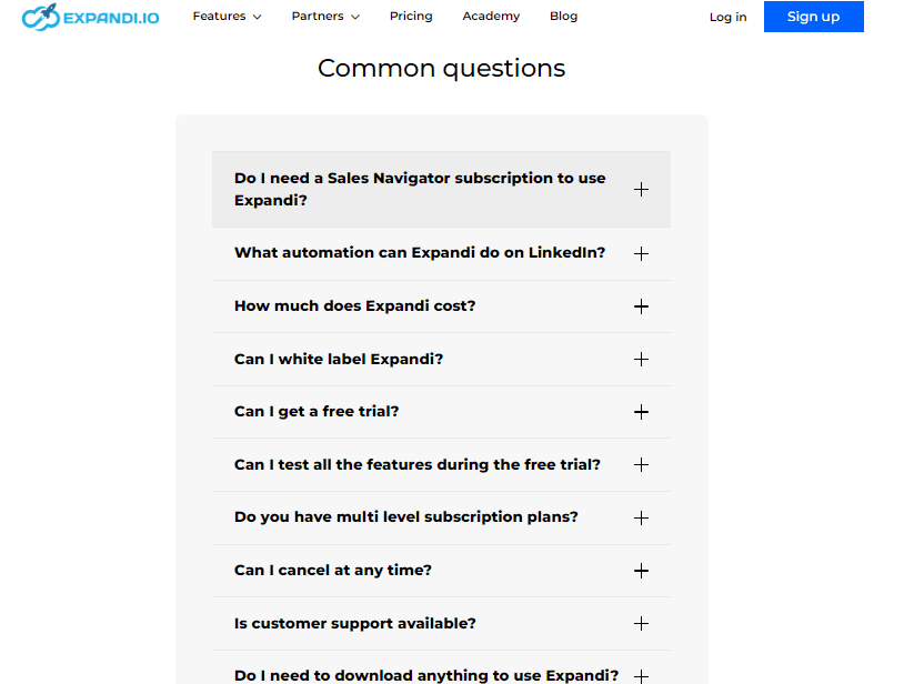
- FAQ sections, tutorials, knowledge bases, and help centers
Of course, there is one trust signal we haven’t mentioned yet, and it deserves more detail. That trust signal is customer reviews.
According to BrightLocal, more consumers now read reviews than ever before. In 2024, 75% of consumers “always” or “regularly” read reviews.
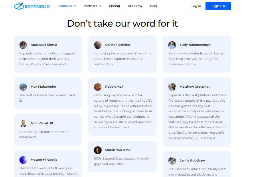
Leads love hearing about a brand from someone other than that brand’s sales and digital marketing teams. And who is better equipped to provide them with valuable information than the actual users of a product or service?
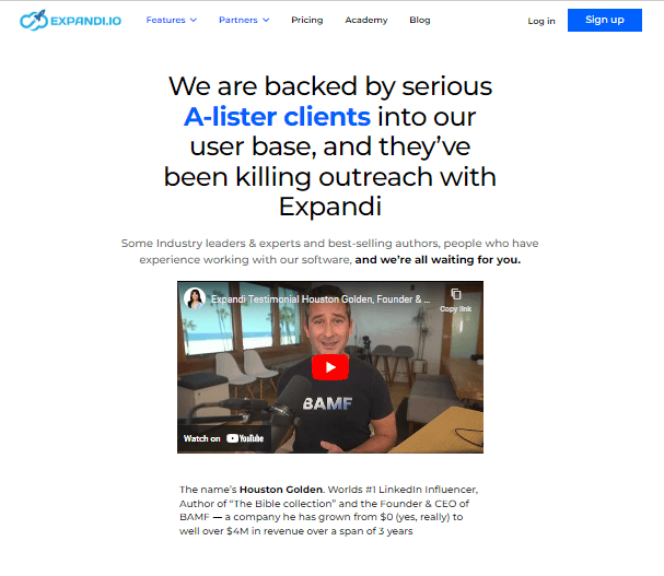
So, make sure to include a number of customer testimonials in written and or/video form on your lead generation website.
In addition, provide links to reputable rating sites (Google, Yelp, Facebook, Tripadvisor, the Better Business Bureau, Apple Maps, Healthgrades, and Trustpilot are the most popular) and publish success stories.
However, be careful not to overdo it, as that can also seriously damage your lead generation process.
You should never delete or ignore reviews that don’t sing your praises, nor should you rely on reviews that are so over the top that they risk sounding fake.
The numbers say it all — 67% of B2B buyers prefer to see a mix of positive and negative reviews on a company review site. Showing a bit of both immediately implies that you have nothing to hide, which is another major plus for gaining your website visitors’ trust.
The main takeaway here is that the more transparent you are about your business, the more likely your lead generation efforts are to pay off.
Leads will feel much more comfortable leaving their contact info and buying from your website when there are green flags to encourage them.
#2. Add live chat so that leads can ask questions quickly
More than 80% of customers report that getting an immediate response from a business when they have an inquiry is a critical factor for their overall brand experience.
It’s no wonder why: today’s lifestyles and schedules are way too hectic for people to just sit around and wait for someone to answer their call or reply to their email.
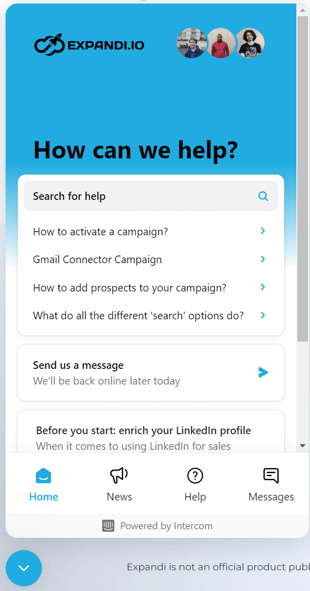
So, incorporating a live chat option into your lead generation website is never a bad idea.
In fact, 51% of consumers are more likely to stay with or buy again from a business if it offers live chat support on its website.
Moreover, having a live chat feature on your lead generation website will increase your overall productivity, as your agents will be able to talk to multiple clients simultaneously.
Finally, you can always opt for having a chatbot that initiates conversations with website visitors and answers some of the more elementary questions, allowing your agents to take over only when necessary.
That way, you’ll save time and money and delight customers all at the same time.
#3. Speed up your website
One of the worst things that can happen when searching online for something is waiting forever for a website to load.
And let’s face it — if website visitors have to be on standby for too long, they’ll just switch to another website that can open in a split second.
Moreover, websites that take too long to load raise suspicion. Many potential leads might think that if you can’t be bothered to make a decent website, your entire business probably isn’t A-grade, either.
So, make sure that your website is fast on all devices, from computers to tablets and smartphones.
But, how fast is fast enough?
Research from Portent shows that a 0-4 second load time is optimal for conversions, and conversion rates drop by 4.42% with each additional second it takes a page to load.
Some of the things that can immediately improve your website loading speed include:
- Optimizing images (i.e., compressing files and reducing their size and resolution)
- Choosing the right hosting provider
- Enabling browser caching
- Fixing broken links
- Using a Content Delivery Network (CDN)
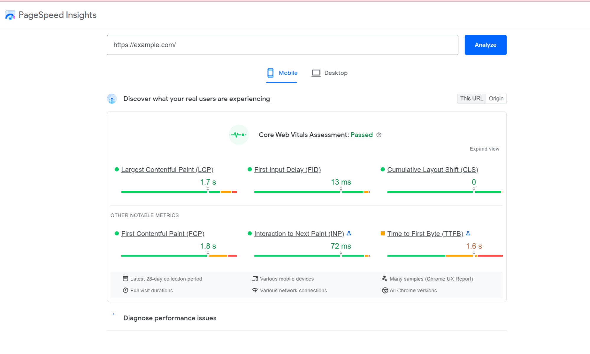
You can easily check how quickly your web pages load via free online tools such as Pingdom, PageSpeed Insights, and GTmetrix.
#4. Leverage white space
White space (or negative space) is the empty space around the content and elements on your web page.
Although this may seem purely a question of aesthetics, web design goes a long way when it comes to lead generation.
The main aim of having white space is to provide website visitors with a clear overview of the landing page they’re on and enable easier navigation.
If your landing pages are overcrowded, with everything piled up on each other, leads will have difficulty navigating the page.
Not to mention that your business image will be severely compromised if your website looks amateurish or just plain ugly.
Consider, for example, The Big Ugly Website:
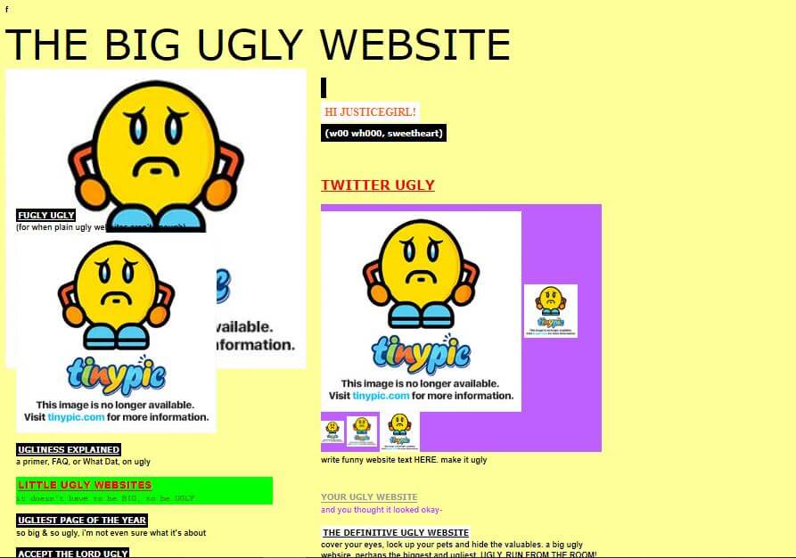
Would you trust a business website like this? I wouldn’t.
There are many red flags of an ugly, unusable website. For example:
- Having blocks of text that go on without an end in sight
- Too many Calls To Action (CTAs) are randomly placed all over the landing page
- Too many distracting elements
White space helps you avoid these red flags.
However, having too much white space can make your website appear unfinished. So, finding the right ratio is crucial.
Aside from making your text more readable and your lead generation website easier on the eye, white space has another key use case: emphasizing essential things.
White space draws the eye to the thing you are trying to emphasize. Some of the elements you’ll want to emphasize include the following:
- CTAs
- Lead magnets like eBooks, free downloadable templates, white papers, comprehensive infographics, etc.
- Lead capturing forms
- Crucial features or product information
#5. Make your website mobile-friendly
Today, more than half of all web traffic comes from mobile devices, so making your website mobile-friendly is a no-brainer. If you don’t optimize your lead generation website for mobile devices, you’ll immediately miss the chance to reach half of the world’s internet users.
Smartphones are a much more convenient way to access the web whenever and wherever we want — every business should keep this in mind when developing their lead generation website.
It’s necessary that your website:
- Is accessible from any device, from computers to tablets and smartphones
- Loads quickly on all devices
- Has appropriately sized buttons and fonts in its mobile version (small buttons are hard to click with fingers)
If you want to check how well-optimized your site is for mobile use, you can test your website on Google Search Console for free.
Here are the results for Expandi.io, for example:

#6. Add short lead capture forms
Incorporating lead capture forms into your web pages is crucial for successfully generating leads.
Lead capture forms enable you to stay in touch with leads by sending promotional materials, special offers, thank you notes when they engage with your website content in a certain way, etc.
The best forms are typically shorter, meaning they don’t require too much information from your leads. In fact, getting their email address is often more than enough.
Some types of businesses, however, will require more information from leads, such as their names, job roles, and the companies they work for.
The secret to ensuring that your lead forms generate more leads continuously is giving website visitors the appropriate incentive to provide their information.
For example, you can offer stuff like:
- Free resources such as case studies, eBooks, templates, guides, and even tools
- Downloadable industry-relevant reports
- Access to webinars, masterclasses, and virtual events
- Newsletter subscriptions
At Expandi, we offer free eBooks full of valuable content:
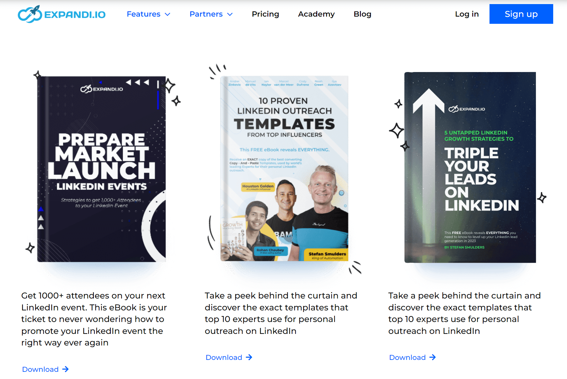
(In case you’re curious, the eBooks are Prepare, Market, Launch LinkedIn Events, 10 Proven LinkedIn Outreach Templates, and Triple Your Leads on LinkedIn.)
Of course, you must ensure that your lead capture forms are placed appropriately, meaning they’re relevant to the landing page they’re on.
If, for example, your lead is reading a blog post on LinkedIn B2B lead generation, you can offer an eBook that teaches readers how to qualify LinkedIn leads. This is far more relevant than, say, a step-by-step guide to web design.
#7. Gamify email signups with a prize wheel
Getting website visitors to fill out email signup forms isn’t easy.
However, if you succeed in making signups look like a fun little game, you’re bound to see an increase in conversions.
Prize wheels, or wheels of fortune, are a sure way to make email signups more attractive and entertaining.
Wheels of fortune are an interactive website element that gives your website visitors a prize in exchange for their email addresses.
This will provide leads with a memorable experience with your brand and increase the number of people who are willing to give you their email addresses.
Of course, the prizes have to be a good enough incentive for visitors to want to spin the wheel.
Depending on your business type, you could offer things like:
- Discounts
- Free shipping
- Giveaways
- Access to an exclusive feature
#8. Don’t make users scroll to find your CTA
You’ve invested lots of time and money into designing your lead generation site, written killer copy, optimized the website for all devices, and added lead magnets and lead capture forms.
In short, all the necessary boxes are ticked, but there’s still a problem: you’re simply not generating as many leads as you had expected.
One of the most common culprits for this situation is bad CTA placement.
We would all love it if our website visitors scrolled through the entire landing page and read and watched everything they found there, but the chances of that happening are pretty slim.
The average time spent on a web page is about 52 seconds, but the exact time visitors spend on your website will depend on many factors — their search intentions, personality, expectations, schedule, your website’s relevance, etc.
This means you shouldn’t risk placing the CTA button at the very bottom of the landing page. Some visitors simply won’t stick around long enough to even see it, let alone click it.
Instead, you should put a CTA in the first section of the landing page, so visitors will be sure to come across it no matter how long they stay on your website.
Placing more than one CTA on a page, either as a popup or as part of the page, is also a good idea that can increase your chances of getting more conversions.
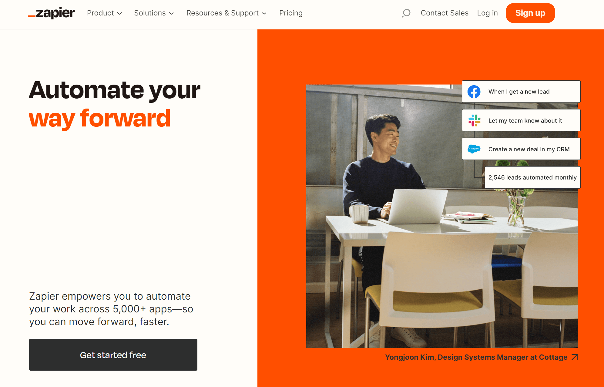
Zapier, for example, has two CTAs: “sign up” and “get started free”.
However, it’s essential to keep your CTAs relevant to the landing page your leads are on and the current content they’re consuming.
When it comes to popups, ensure they’re triggered by several actions or shown after a certain amount of time has been spent on a landing page. Otherwise, you’ll come across as spammy.
Finally, don’t overdo it. There’s a fine line between being professional and being obnoxious, so make sure you don’t cross it.
#9. Offer free, gated content
Gated content, provided it’s valuable enough for your website visitors, is always an excellent trigger for them to give you their information.
The concept of gated content means that visitors have to fill out a lead capture form before gaining access to the content (e.g., reports, white papers, articles, videos, demos, etc.).
The form may ask only for the visitor’s name and email address, but it often requires more details, usually concerning their job title and company.
For example, Comscore asks for the following information from visitors wanting to download its State of Social Media report.
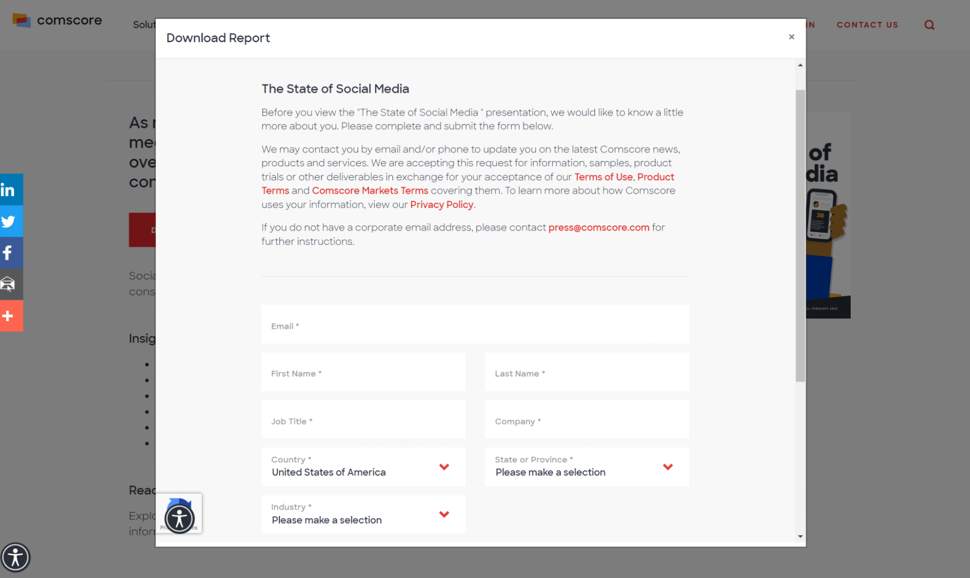
Asking for these details is good for both you and leads: you get their information, and they get content they would have had to pay for otherwise.
#10. Personalize your CTAs
Research from McKinsey and Company has shown that:
- 71% of consumers expect companies to provide a personalized experience
- 76% of consumers are more likely to purchase a product from brands that excel in personalization
So, you should incorporate personalization into your overall lead generation process, and CTAs are one of the most crucial things to personalize.
In fact, CTAs tailored to each lead convert 202% better than generic CTAs.
There are a number of things you can do to create a highly-personalized CTA.
For example, you could show different CTAs to first-time website visitors, qualified leads, and recurring customers.
Depending on the type of visitor, you could offer a free learning resource, a free trial, or a discount, respectively.
You can personalize the CTA further if you have more data on a specific website visitor, such as:
- Their job role and company
- Insight into their previous interactions with your website
- The country they’re from
The possibilities are virtually endless. Although, in reality, they depend on the info you have on your target audience.
#11. Don’t give visitors too many choices
If your lead generation website is too difficult to navigate, cluttered with content, or requires leads to make too many steps and decisions to checkout, leads may abandon their mission entirely.
Overwhelming leads is a sure way to get them to quickly lose interest in your brand, no matter how much good it can do them.
Instead, you should do your best to guide them through the entire process in a way that’s as simple and direct as possible.
For example:
- Highlight the most important parts of your website, such as CTAs and downloadable resources, by putting them in places where they can stand out the most
- Don’t offer too many CTAs and offers. Stick to a single, competitive offer.
- Make email signup and lead capture forms easy and fun where possible
- Keep the CTAs and resources you offer relevant to the landing page your leads are currently on and the content they’ve shown interest in
If you don’t know what works best, you can always conduct A/B tests to pinpoint what kind of website elements resonate with your leads.
#12. Add quizzes
Another way to gamify leads’ experience and get them to engage with your brand is by adding quizzes to your lead generation website.
For example, Adobe offers a personality test for creatives:

Interactive content rarely fails to attract leads, and quizzes are one of the most popular types of such content.
Once your website visitors have completed the quiz, they’ll have to provide their email addresses to get the results.
That way, you’ll successfully convert visitors and create an opportunity to engage them further.
If you decide to include a quiz on your website, you should make sure that it’s somehow relevant to the product or service you’re offering.
For example, if you’ve developed a sales prospecting tool, there’s not much sense in having a “which Game of Thrones character are you?” quiz.
Just keep it related to your business and ensure it entertains and nurtures leads as much as possible.
Final thoughts: Lead generation websites
Applying these consumer psychology-based frameworks will significantly improve your lead generation efforts.
Of course, you don’t have to implement each of them to supercharge your lead generation process. What works best for you will primarily depend on the type of business you run and your target audience.
What you need for optimal results is a comprehensive lead generation strategy.
And one thing you should, by all means, incorporate into your lead generation campaign is LinkedIn — the #1 network for lead generation.
In fact, combining LinkedIn with website lead generation is a strategy that consistently delivers a steady stream of Marketing Qualified Leads (MQLs) and Sales Qualified Leads (SQLs).
And if you want to simplify your lead generation process further, give Expandi a go.
Expandi is a cloud-based LinkedIn automation tool that can boost lead generation and outreach efforts.
Only the best strategies will bring the best results
New articles straight to your inbox


