How to Bold Text in a LinkedIn Post & Format Posts Properly


You keep seeing LinkedIn posts with bold hooks that stop the scroll, but when you write your own, the bold button is nowhere to be found.
So your posts go out as flat blocks of text, and flat blocks of text get skimmed past.
Here’s the short answer to your question: real rich-text formatting exists in two places on LinkedIn: articles and newsletters. Everywhere else, bold gets pasted in.
I’ve tested these formatting and scheduling tools first-hand for LinkedIn content marketing: writing and scheduling my own posts, and ghostwriting for founders. Every formatter recommended below passed that day-to-day use test in July 2026.
Here’s what we’ll cover about formatting LinkedIn posts:
- The exact steps on desktop and mobile.
- Where styled text renders and where it silently breaks.
- All 10 LinkedIn post formats.
- Four formatting tricks that need no tool at all.
- Five formatting tools that passed the test.
ArticleKey Takeaways
- You can bold text in a LinkedIn post with a free Unicode formatter: type your text, pick the bold style, copy, and paste it into your post.
- LinkedIn’s post editor has zero formatting buttons. Real rich text exists only in articles and newsletters.
- Styled Unicode characters trip up screen readers and some older devices, so bold a word or two for emphasis and keep hashtags and @mentions plain.
- Native tricks fix readability without any tool: line breaks, symbols, short paragraphs, and a handful of emojis.
How to Bold Text in a LinkedIn Post & Format Posts Properly


How to bold text in a LinkedIn post
To bold text in a LinkedIn post:
- Draft your post in LinkedIn’s post editor or a doc.
- Open a free LinkedIn text formatter like Typegrow or Typefully.
- Paste the words you want to bold into the tool.
- Copy the bold version it generates.
- Replace the plain text in your LinkedIn post with it.
- Preview the post and publish.
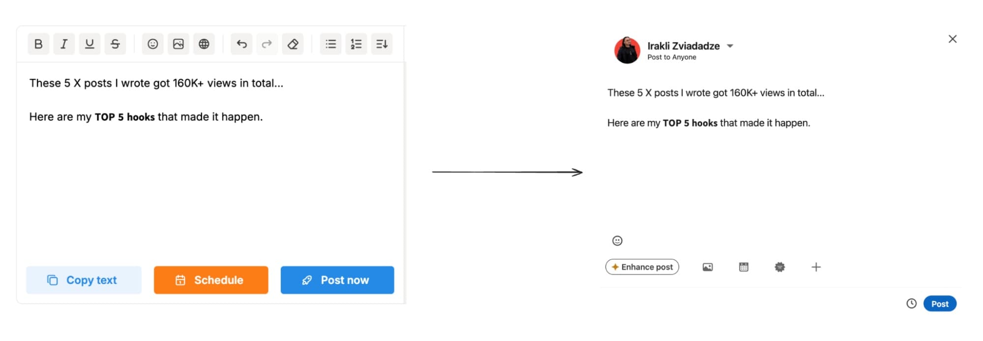
Bold works for single words, full lines, or section headers. The strongest use is the narrowest one: bold your hook and your section headers, and leave the rest of the post plain.
How to bold text in a LinkedIn post on mobile
The LinkedIn mobile app has the same gap as desktop, and the fix is the same tool in a different window: a formatter open in your phone’s browser.
To make text bold in a LinkedIn post from your phone:
- Open a text formatter on your phone browser
- Type or paste the words you want bolded.
- Copy the bold version to your clipboard.
- Switch to the LinkedIn app and paste it into your draft.
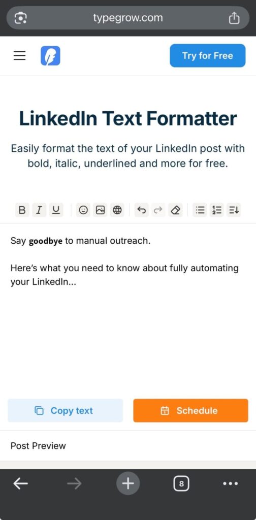
A faster routine for regular posters: draft the full post in the LinkedIn app first, then style only the hook and header lines in the browser. You avoid bouncing the entire post between apps.
Why bold text works on LinkedIn
The bold you see on LinkedIn is a different alphabet, technically.
Formatters swap your regular letters for characters from Unicode’s Mathematical Alphanumeric Symbols block, where 𝗯𝗼𝗹𝗱 letters are distinct symbols the same way emojis are.
LinkedIn treats them as ordinary characters.
That is why they paste anywhere, survive publishing, and need no plugin. It is also the root of every problem covered in the next section: to a machine reading your post, a styled word and its plain-text twin are entirely different strings.
Where bold text works on LinkedIn and where it breaks content
Bold text does two things in a LinkedIn post: it makes the post skimmable, and it highlights the lines you want remembered. A bolded hook or section header gives a scrolling reader something to grab onto, and a bolded phrase mid-post tells them exactly where the point is.
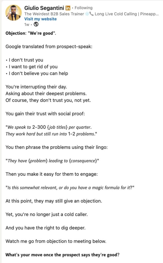
That covers posts and longer comments, and that is where the trick earns its keep.
Styled text technically pastes into any LinkedIn text field: your headline, your About section, messages.
But the further you get from the feed, the less it does for you. Same rule everywhere: a word or two, no more. And if you’re touching your profile anyway, get the fundamentals right first with our LinkedIn profile tips.
10 types of LinkedIn post formats
Formatting starts before you touch a single character: picking the post format is the first formatting decision. LinkedIn officially supports 10 post types, and each one shapes how much text formatting you need and how many impressions on LinkedIn the post can earn.
Rotating through formats also beats posting fatigue, both yours and your audience’s. Peep Laja put it plainly when he talked LinkedIn strategy with GTM Society:
“I’m still going to keep on posting on LinkedIn and see what’s up because the channel is working for me. I think you’ve got to do better content and experiment with formats. And so I think the upfront investment in what kind of content you’re creating, that will require more thought to break through.” — Peep Laja, founder and CEO of Wynter, a B2B message testing platform
1. Text-only posts
Plain text, no media. The format for storytelling, opinions, and discussion starters. Text-only posts lean hardest on formatting: with no visual to stop the scroll, your line breaks and hook do all the work.
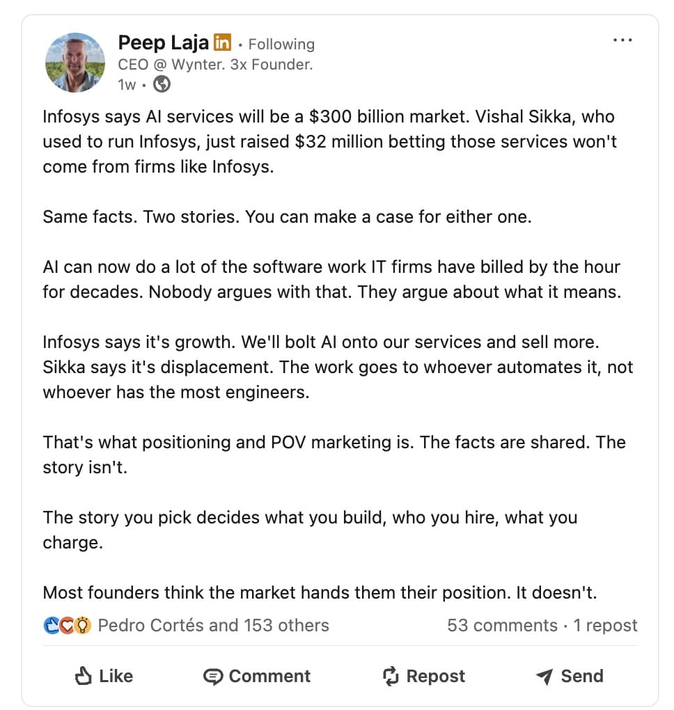
Formatting tip: give the hook its own line, keep the first two lines under the “…more” cutoff, and bold at most one phrase in the whole post.
2. Single-image posts
One photo, chart, or infographic with supporting text. Strongest when the image carries one idea and the caption adds context the image lacks.
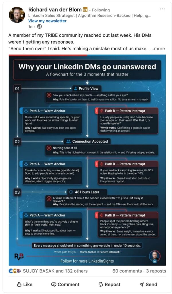
Formatting tip: the caption competes with the image for attention, so keep it short and put the takeaway in the first line.
3. Multi-image posts
Several photos in one post. Built for visual sequences: event recaps, before-and-after comparisons, team moments.
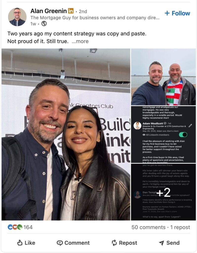
Formatting tip: number the caption to match the images (1. the before, 2. the after) so readers connect text to visuals as they swipe.
4. Native video posts
Video uploaded directly to LinkedIn, which autoplays in the feed and buys you attention before a single word is read. Add captions, since feeds default to muted playback.
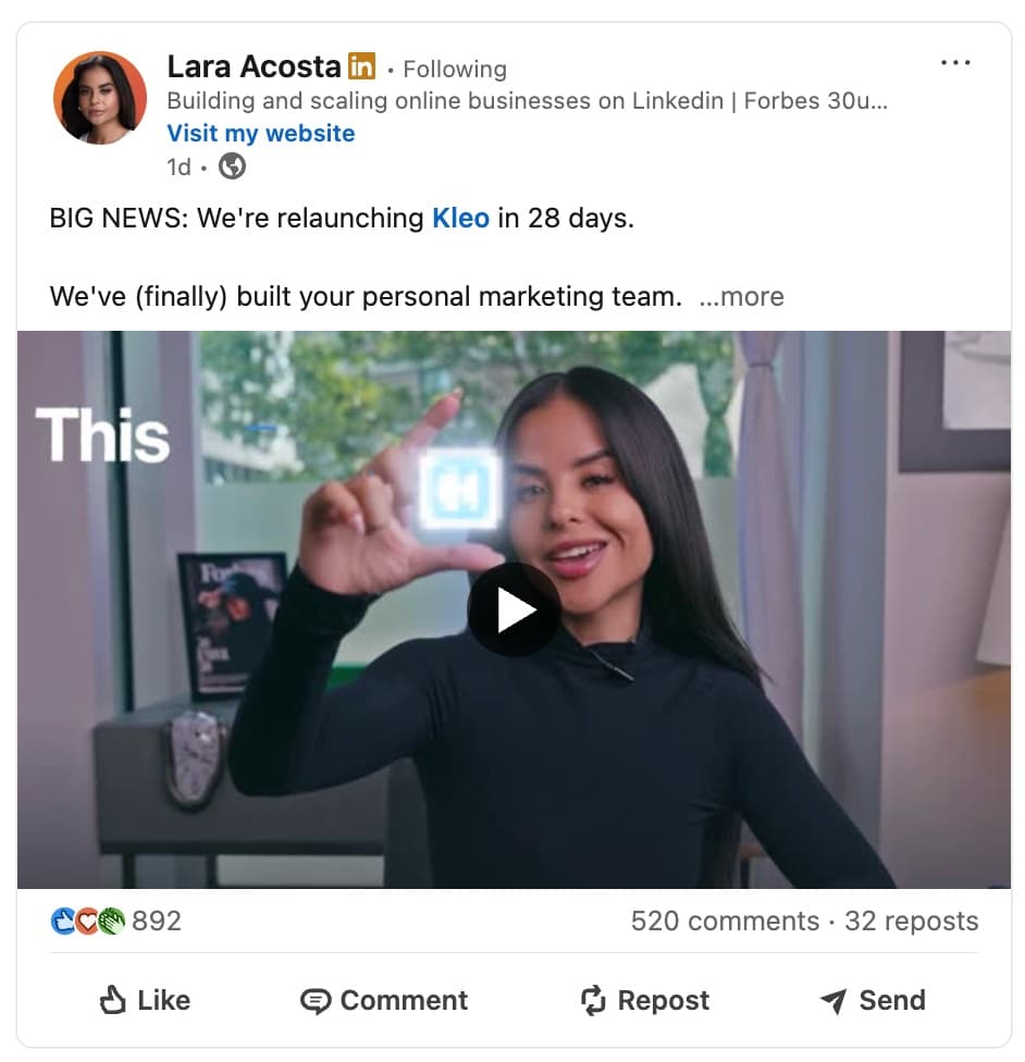
Formatting tip: the text above the video is a headline, so write it like one. A single bolded line telling viewers what they will learn beats a paragraph of setup.
5. Articles
Long-form editorial pieces published on your profile or company page. Articles come with a real rich-text editor, so this is where actual bold, headings, and bullet lists live.
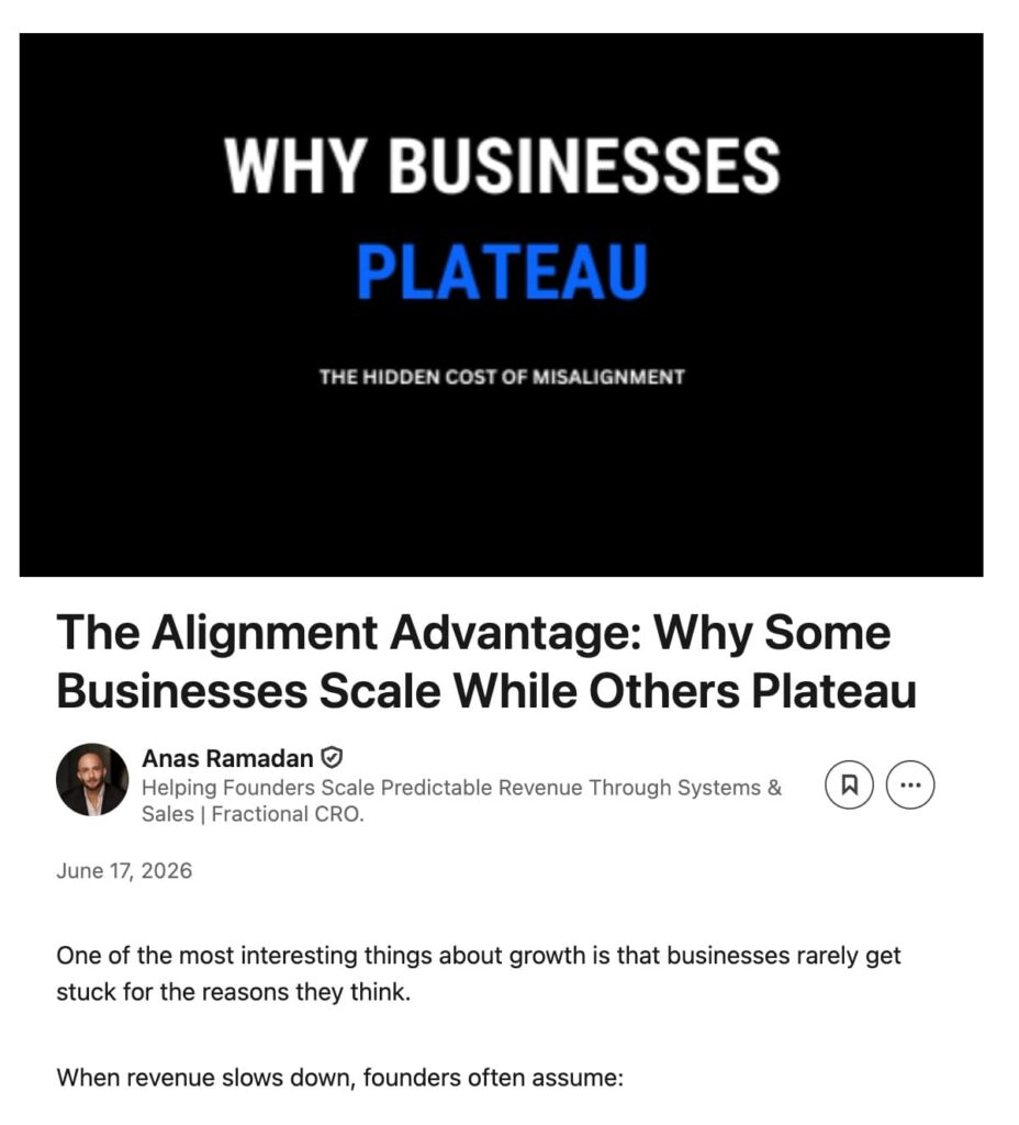
Articles also get their own URL and SEO settings, which makes them the one LinkedIn format search engines index like a blog post.
6. Newsletters
A recurring article series that members can subscribe to. Same rich-text editor as articles, plus a subscriber base that compounds with every edition.
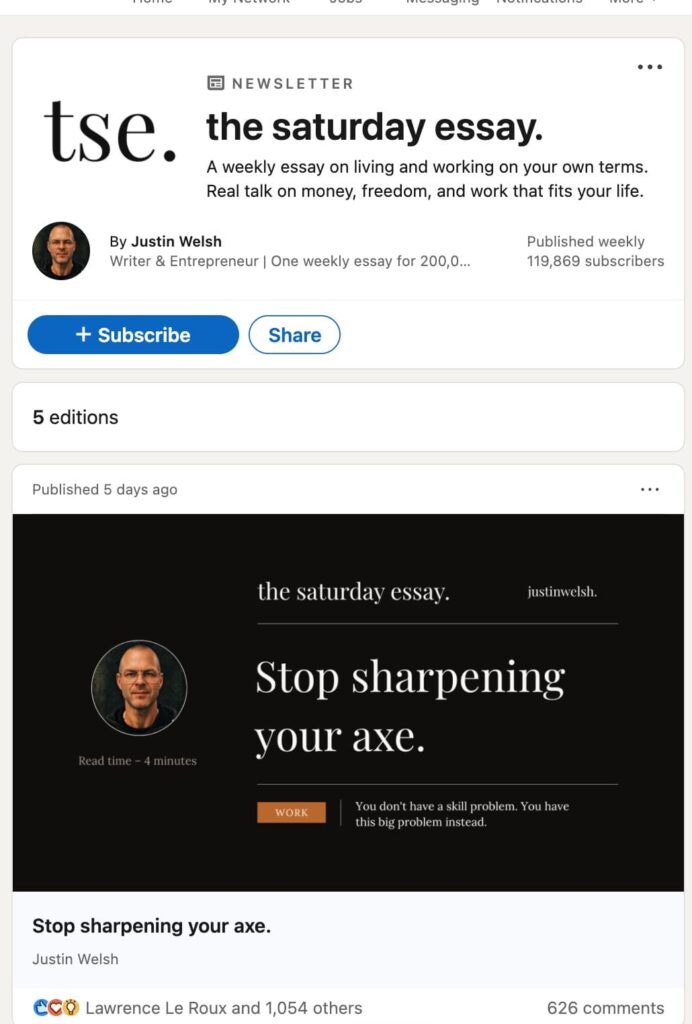
If your team publishes on a schedule, a newsletter converts one-off readers into a recurring audience.
7. Documents
PDFs, Word files, or slide decks uploaded straight into the feed, swiped like a carousel. Per Richard van der Blom’s Algorithm Insights Report 2026, built on 1.3M+ posts, the sweet spot is 9.2 slides per document.
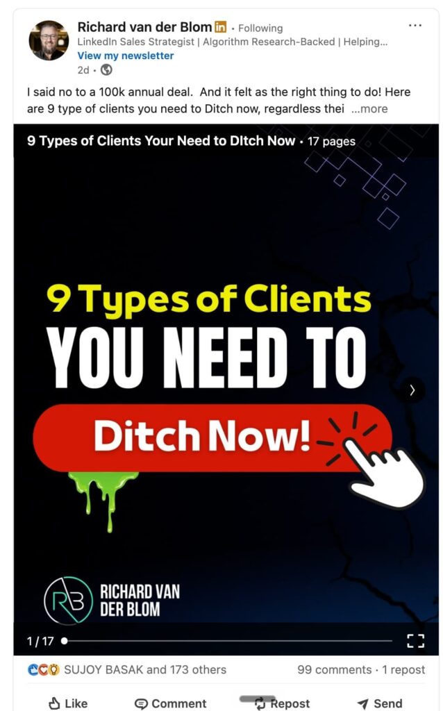
Formatting tip: since you design the slides outside LinkedIn, documents are the one feed format with full typographic control. Use real fonts there and skip the Unicode trick entirely. For more info on this, see our full guide on LinkedIn carousels.
8. Celebrate an occasion
LinkedIn’s built-in template for milestones, new roles, and team achievements or promotions.
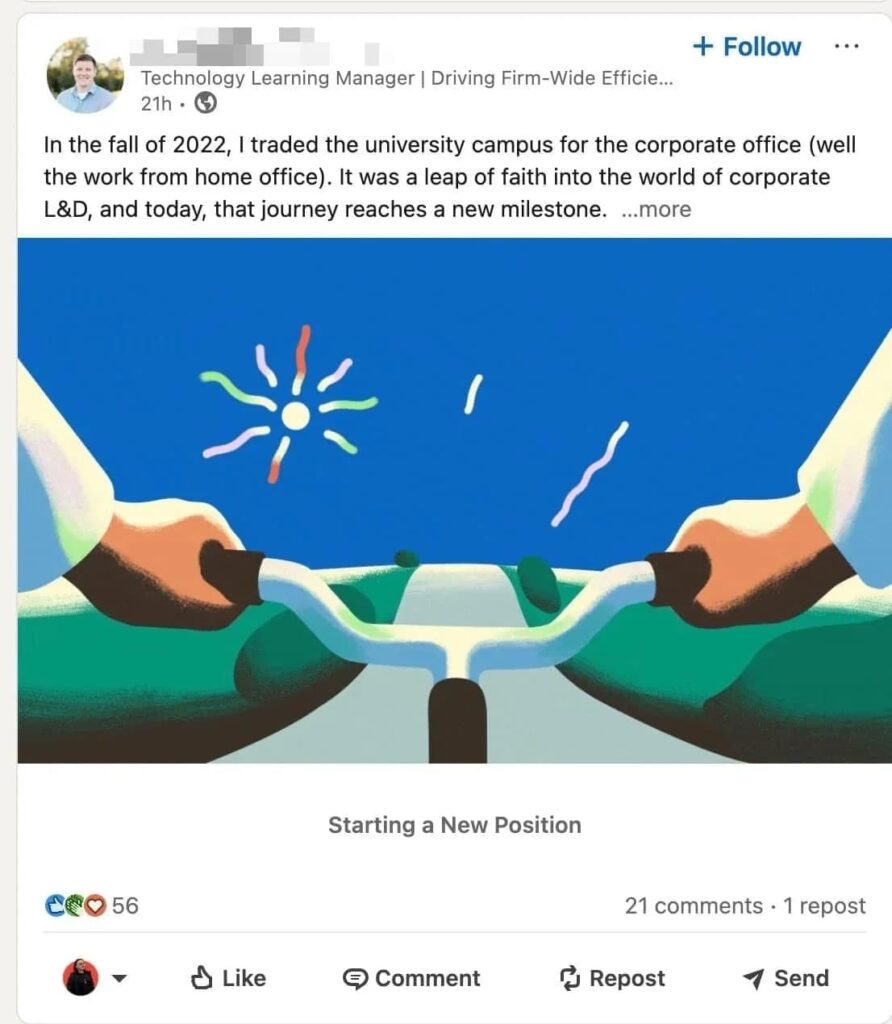
Low effort by design, so save it for moments that genuinely warrant it.
9. Polls
Quick surveys with up to four answer options, capped at 30 characters per option.
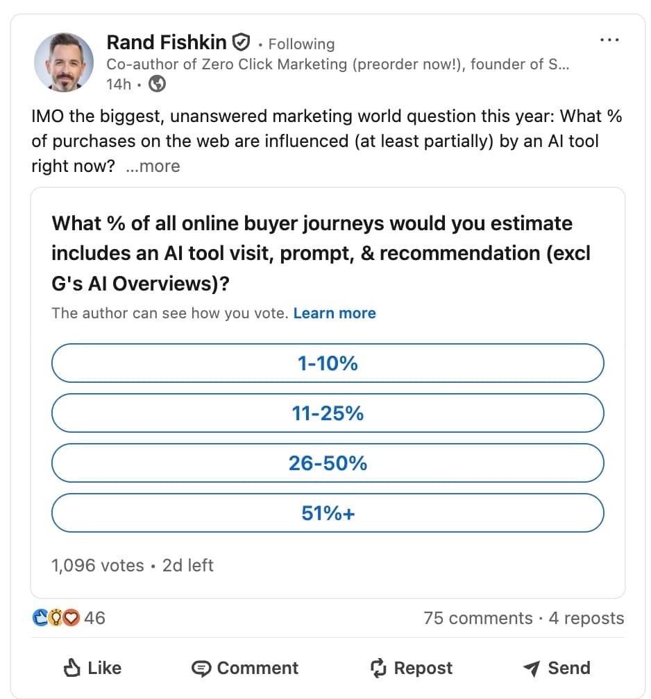
Good for validating a take before you write the full post about it, and the voter list doubles as an audience signal for your next piece of content.
10. Reposts
Sharing someone else’s content with your own commentary on top. The commentary is the post: a repost with a real take earns a spot in the feed, a bare repost adds nothing.
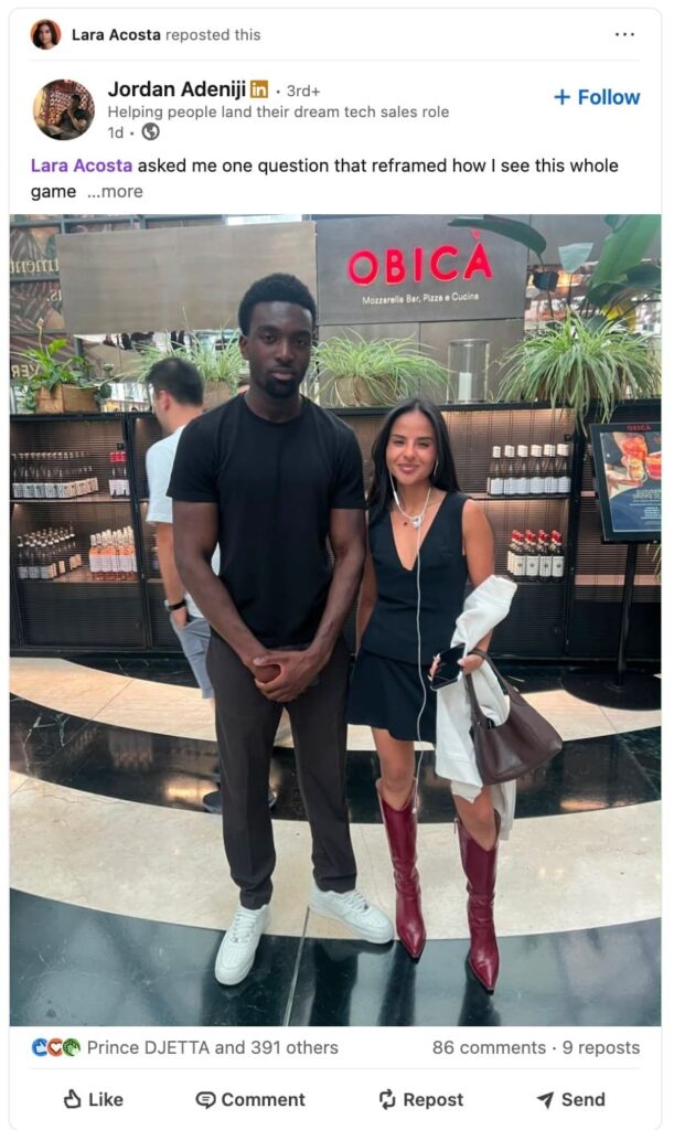
Two or three lines on why the piece matters to your audience is enough.
4 ways to format text in the native LinkedIn editor
Before reaching for any tool, four formatting moves work inside LinkedIn’s plain post editor: line breaks, symbols, scannable writing, and restrained emoji use.
Combined, they fix the wall-of-text problem that kills read-through.
Method 1: Line breaks and white space
Big text blocks kill engagement, and white space is the cheapest fix. Keep paragraphs to one or two lines, add an empty line between ideas, and give your hook its own line at the top.
Readers bail on dense posts within seconds, and the LinkedIn algorithm reads early bail-outs as a reason to stop distributing the post.
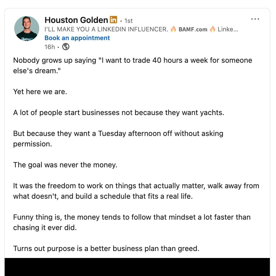
A useful test before publishing: view the draft on your phone. A paragraph that looks fine on desktop wraps into six dense lines on mobile, where the bulk of your readers are scrolling.
Method 2: Symbols and punctuation as visual structure
The editor accepts symbols like arrows (→), dashes, and brackets, which can mark list items or section transitions. For example:
→ Point one on its own line
→ Point two, same shape
Keep it minimal. A few arrows structure a post, a dozen make it look like a ransom note.
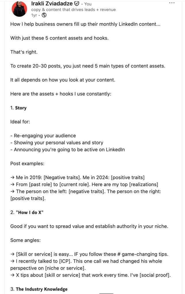
Pick one symbol per post and let repetition do the organizing.
Method 3: Scannable writing
Structure is a writing job before it is a styling job. Short lines with one idea each, a colon to set up a list, caps reserved for acronyms. These carry a reader further than any Unicode trick, and they are part of a broader set of LinkedIn features that cost nothing.
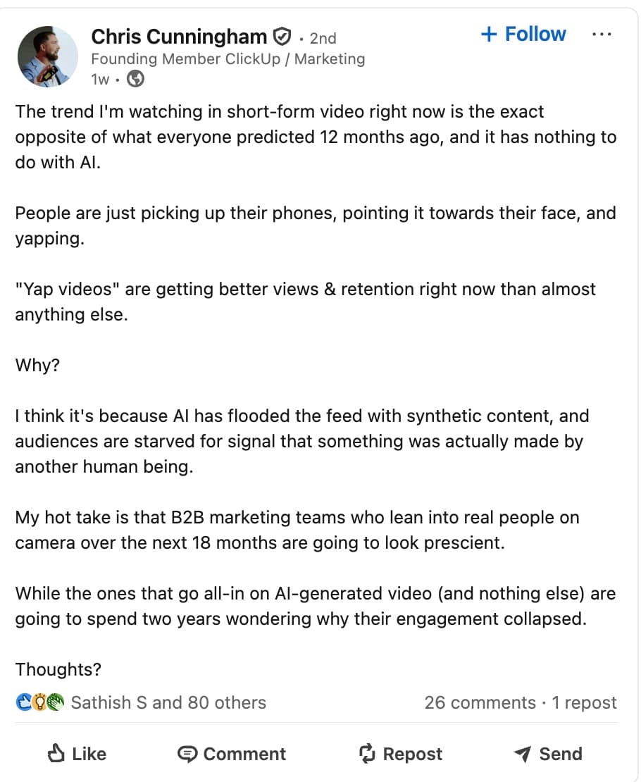
Structure gets the skim. Substance gets the read. Chris Cunningham’s advice for winning on LinkedIn skips styling entirely from his GTM Society interview:
“Then you’ll win on LinkedIn because people want to learn from real things… So write what you’re going through each day, document it, and put it out there.” — Chris Cunningham, who started ClickUp, the project management platform
Method 4: Emojis with restraint
Emojis can replace bullet points (⭐ tip #1), mark a transition, or group related ideas. Use them to mark structure.
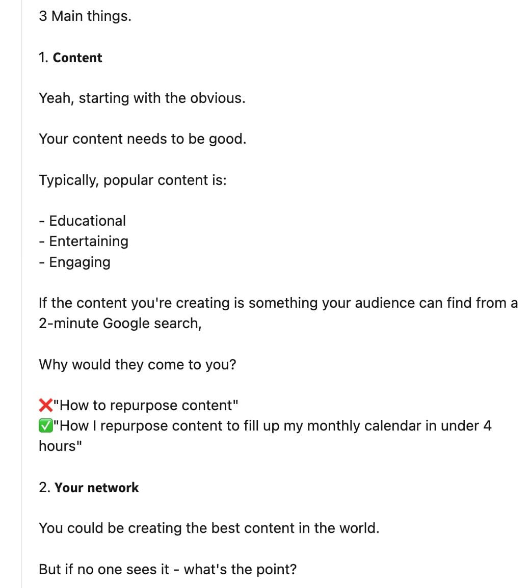
Decorating every line with them drowns the signal, and two or three per post is plenty for a professional feed.
5 free text formatters to bold text in a LinkedIn post
If all you need is a bolded hook, any of these five works: type, copy, paste, done. All five are free, run in the browser, and skip the login.
The differences show up around the edges — how well you can preview the post before publishing, how much text you can style at once, and how many style variants you get. The short version:
| Tool | Bold and italic | Extra styles | Post preview | Login required |
|---|---|---|---|---|
| Typegrow | Yes | Underline, strikethrough, lists | Yes, with see-more cutoff | No |
| Typefully | Yes | Underline, strikethrough, decorative | Yes, desktop and mobile toggle (no see-more cutoff) | No |
| Poper | Yes | Underline, strikethrough, decorative | Yes, no see-more cutoff | No |
| Flowpost | Yes | Underline, strikethrough, novelty | No | No |
| AuthoredUp | Yes | Bullets, numbered lists | Separate free preview tool | No |
Here’s how each works in detail.
Typegrow: the see-more preview
Typegrow covers bold, italic, underline, strikethrough, and list formats, and its preview shows exactly where LinkedIn’s “…more” cutoff lands.
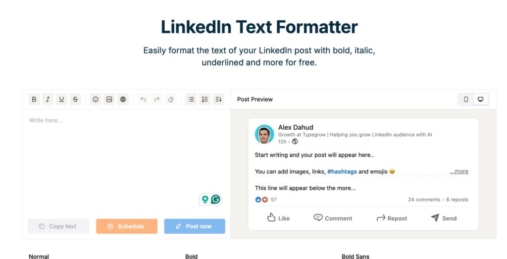
That preview makes it the default pick for feed posts: you style the hook, then see whether it survives the fold before publishing. If you bookmark one tool from this list, bookmark this one.
Typefully: the core styles plus device previews
Typefully’s formatter handles the same core styles in a cleaner editor, with a feed-style preview you can flip between desktop and mobile.
One gap: the preview stops short of showing the “…more” cutoff, which sits in Typefully’s separate post preview tool instead. Pick it if you already draft and schedule your content in Typefully, or if you want the device toggle without leaving the page.
Poper: core styles plus a character counter
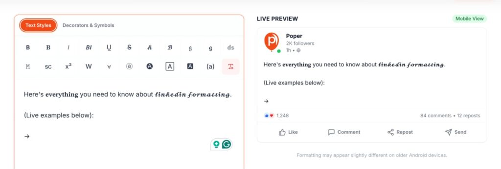
Poper’s formatter covers bold and italic, then keeps going: gothic, script, circled, squared, upside-down — a full shelf of decorative styles with no place in a work feed.
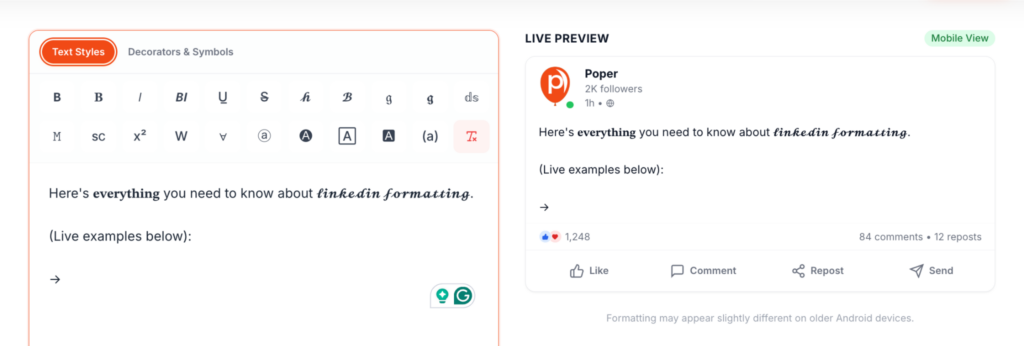
The live preview mocks up your post but skips the “…more” cutoff. Its one practical extra is the character counter, which tracks LinkedIn’s 3,000-character post limit as you type. Fine as a backup, but Typegrow does the part that matters better.
Flowpost: quick styling for short snippets
Flowpost does exactly one thing: you type a line into a box capped at 150 characters, and it lists every style variant with a copy button next to each — bold, italic, underline, then circled, squared, and upside-down text that will never see a work feed.
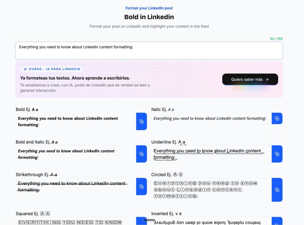
No preview, no extras. Fine for styling a quick hook, and that’s the whole job.
AuthoredUp: the core styles plus a toolbox around them
AuthoredUp’s free formatter handles bold, italic, underline, strikethrough, bullets, and numbered lists without a signup.
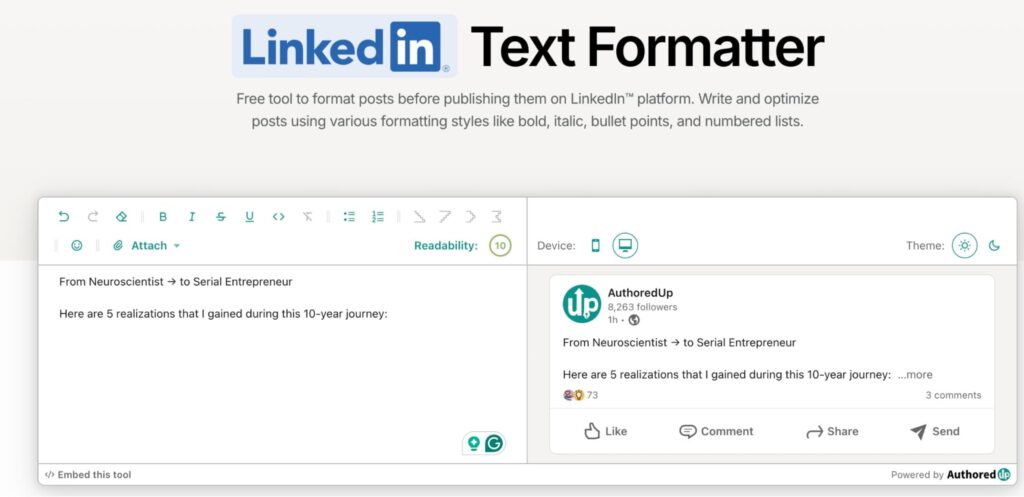
Post preview lives in a separate free tool on the same site, alongside a set of other LinkedIn utilities. Pick it if you want the formatter and the toolbox in one bookmark.
How to bold LinkedIn text without a formatting tool
Two methods put bold text on LinkedIn with no third-party tool: publishing an article or newsletter, which have a real rich-text editor, or pasting pre-formatted text from Google Docs or Word into a post.
Publish an article or newsletter for real rich text
To use LinkedIn’s actual formatting toolbar:
- Click “Write article” in the share box on your homepage.
- Add or skip the cover image.
- Select text and apply bold, italics, or headings from the toolbar.
- Add bullets, numbered lists, quotes, or embedded media as needed.
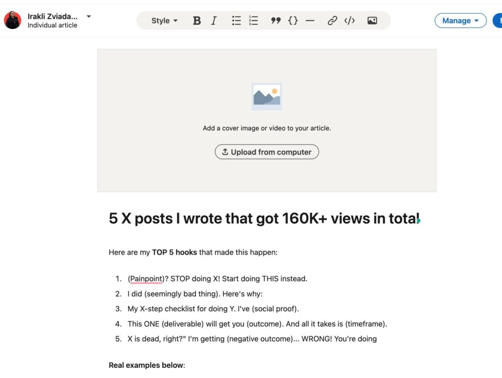
Best for in-depth pieces: reports, tutorials, thought leadership. The formatting is real HTML, so search engines and screen readers read it correctly.
Copy and paste formatted text from Google Docs or Word
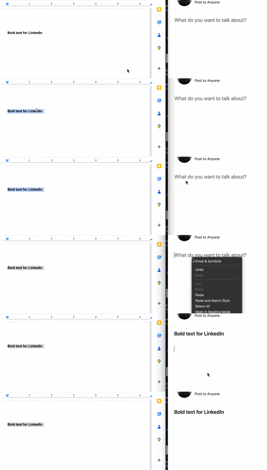
Text formatted in Google Docs or Word can carry its styling into a LinkedIn post when pasted.
Bold, italics, and bullet points survive the paste. Underlines, strikethroughs, and custom fonts drop to plain text.
When NOT to bold and format your LinkedIn posts
Skip Unicode styling where it breaks something, and treat everything else as emphasis: the hook, a section header, or the one line you want acted on, like the closing question that asks for a comment.
The decision rules:
- Keep functional text plain: links, hashtags, and @mentions.
- Cap yourself at one or two styles per post. Bold everything and nothing stands out. As a rule of thumb, less is more.
- Mind screen readers: in accessibility consultant Adrian Roselli’s 2025 tests, some read each styled letter aloud one at a time and others skipped the styled words entirely. Anyone listening to your post gets noise or gaps.
- Match the room. A feed full of executives reads heavy styling as noise, and a plain, well-spaced post as confidence.
The pattern behind these rules: native structure first, Unicode styling as garnish. A post with a strong hook, short paragraphs, and one bolded line outperforms a post wearing every style a formatter offers.
How to turn formatted posts into LinkedIn sales pipeline
A well-formatted post earns reactions and comments. Every one of those engagers is a warm lead who just told you what they care about, and this is where posting connects to outreach.
Expandi’s Post Engagement lead list takes the URL of any LinkedIn post, yours or anyone’s in your niche, and pulls up to 2,500-3,000 people who reacted to or commented on it into a campaign.
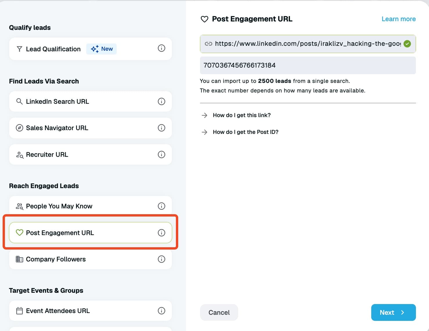
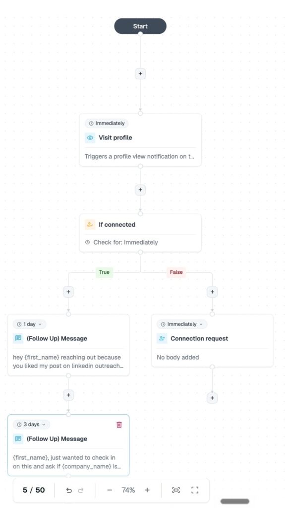
From there, a Builder sequence can visit their profile, send a connection request that references the post, and follow up automatically if you’re connected. If not, the sequence sends a connection request.
Consistent posting compounds the effect: it feeds your Social Selling Index, keeps your profile warm for the prospects your campaigns touch, and turns your content into a steady source for LinkedIn lead generation.
Bold your LinkedIn posts properly and put them to work
Bold text in a LinkedIn post comes down to one move: convert your text with a free Unicode formatter and paste it back in, since LinkedIn’s post editor has no formatting buttons.
Use it on hooks and headers, keep hashtags and mentions plain, and let line breaks and short paragraphs do the heavy lifting.
Then put the post engagement to work: a formatted post that stops the scroll is a lead list waiting to be built.
Start your 7-day free trial and turn your next post’s engagers into a campaign to see how it works live.
FAQs about bolding text on LinkedIn
Yes, you can bold text in a LinkedIn post, even though LinkedIn’s post editor has no bold button.
Convert your text with a free Unicode formatter, copy the bold version it generates, and paste it back into your post. The bold characters survive because they are separate Unicode symbols, the same way emojis are.
Paste your text into a free Unicode formatter, pick the italic style — same method as bold — copy the result, and paste it into your post. Italic reads harder than bold at feed size, so use it for short phrases only.
Yes — bold Unicode text pastes into any LinkedIn text field, including the headline and About section. Convert the words in a free formatter, copy the bold version, and paste it in. Bold one or two words for emphasis rather than the whole line, so the text stays easy to read.
LinkedIn has published no penalty for Unicode-styled text. The cost is indirect: styled words drop out of search results, and some screen readers misread them.
Formatting that improves readability can help the engagement signals that drive reach, so the net effect depends on restraint.
Formatters build bold text from a special Unicode character range, and some older devices and fonts have no glyphs for it. Those systems render each styled character as a hollow rectangle.
There is no fix on your end beyond using styled text sparingly.
Formatters like Typegrow, Typefully, and Poper generate underlined text by adding combining underline characters.
Support is spottier than bold or italic, and underlined text on the web reads as a link. Skip it unless you have a specific reason.


You’ve made it all the way down here, take the final step